Thursday, March 31, 2016

No. 64 Jim McCarthy


First Prog: 37 (but as a mainstay, 500)
Latest Prog: 1961 (before the latest book of Bad Company, a Future Shock in Prog 1310)
 
Total appearances: 142

McCarthy's imagination and colour palette are equally vibrant.
Words by Grant Morrison


Creator Credits:
Bix Barton
The Grudge Father
Kid Cyborg

Other art credits:
Bad Company (series inker from beginning to end)
Rogue Trooper (inking again)
Zenith
The Geek, a one-off from Crisis that I have no memory of
A bunch of Future Shocks, including some of the very first)
…curiously, no Dredds.

Notable character creations:
Bix Barton
The Grudge Father
-is Kid Cyborg notable? Time, and perhaps one day a long overdue reprint with the Megazine, will tell…

Are you the future, Kid Cyborg, are you?
Words by Kek-W
 
Notable characteristics:
Generally anarchic. Sparkly – but also grungy. Absolutely not shy of gore. Has a way with raised eyebrows and body language generally. There’s something inherently earthy and fleshy about his work that I find v. appealing.


On Jim:
McCarthy got his start in the Prog inking over the top of his good pal Brett Ewins’s pencil art on two of the very earliest Future Shocks. For reasons unknown, Ewins made a go of it alone after that, until the launch of hot new series with Prog 500, Bad Company. McCarthy was on fire for that seies. And, in turn, he began to get work as an artist in his own right. Now, I’m not much of one for being able to recognise the work of different inkers, but I will say that McCarthy full artwork looks amazingly like one would expect based on his inking style.

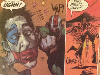
McCarthy inking over Ewins. 2000AD was despatching zombies decades before they were cool.
Words by Peter Milligan


A helpful panel showing Rufus Dayglo's un-inked pencils next to the inked version.
That shadow on Danny Franks's jumper, that's classic J. McCarthy.
Words by Peter Milligan
Which is to say, thick, lush, vibrant, fun and a little bit loose.

McCarthy inking over himself. Everything feels so tangibly present, doesn't it?
Words by Peter Milligan

I’m not sure there’s much to say about Bad Company that hasn’t been said already. It’s excellent, it’s gorgeous. The ink work is no small part of that!

The changing face of Danny Franks.
Words by Peter Milligan


This cover is McCarthy’s own work (B.E. on the cover is presumably Brett Ewins, who may have inked?) – you can tell by the teeth! It’s entirely in keeping with the series style.

How do decayed zombie glands generate saliva anyway?
 
I suppose it’s inevitable when friends/family learn to draw together, but it can’t be denied that Jim does share some stylistic DNA with both Brett Ewins and baby brother Brendan.
Check out the faces and lapels in this early Bix Barton panel…

That attire is pure Brendan McCarthy, no? And the eyebrows + clothing creases are Ewins all over.
But the shiny bodywork on the car, and the delightful clouds - that's all Jim.
Words by Peter Milligan.
Around the time Jim and the Prog moved to more colour, his work took on much more of a life of its own. It becomes, for want of a better word, rounder. Or maybe that’s just the presence of women, a species almost entirely absent from Bad Company.
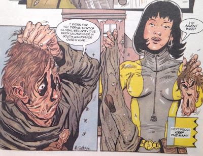
Rotting fleshbag turns into hot babe - does that count as body horror?
Words by that man again, Peter Milligan

A lot of the charm of Bix Barton is in the world around him – the flying car, the endless clouds, the general air of a Britain slightly off to the side, if not in the future. (Although the series is, I think, technically set a few years into the future).

And so to the Grudgefather, ‘based on an original grudge held by Jim McCarthy’. Wordplay aside, I assume what that means is that it was McCarthy’s idea to explore the ramifications of human cloning, how this would intersect with religious faith (apparently by completely superseding it, while retaining a largely Roman Catholic flavour). Also key is the idea that once human cloning was perfected, there’d be no more room for new beings to appear – our spirit essences will simply hop from body to body, with the genetic engineers sorting it all out for us.

McCarthy's art really came into its own with this series. And I do love the main character design, with the face mask that actually holds his constantly rotting clone-flesh together.
Words by Mark Millar
 
So it’s more fiction than science, but a neat premise. What may or may not be more of a Millar influence is the fact that the series ended up being amongst the goriest ever to see print. It’s total body horror, in the most Cronenbergian, pre-CGI oozy vein-bursting sense. Yum! Also: squish.

"She unzips her DNA like a favourite dress." How do you draw that??
Words by Kek-W this time.

As with Canon Fodder, scripter Kek-W took over for a more coherent, more intelligent but less lurid second series. Meg floppy, please, Tharg!*

Teaming with Kek-W then yielded McCarthy’s last hurrah (until Bad Company made its recent, triumphant return): Kid Cyborg. I dearly wanted to love this series, but it’s not quite all there. The design for Kid himself is pleasing. He’s part robot, part creepy but significantly heroic in demeanour. He’s teamed with a neat pair of companions. Vector 13’s Men in Black put in an extended cameo, essentially as villains, and McCarthy draws them particularly well, with all the menace of bureaucracy hidden behind there sunglasses and grey skin. There’s the plot itself, which is sort of about contemporary politics and mass media and all that. Frankly, it needed to be a 24-part epic to squeeze it all in, but that was never gonna happen in 1994.

Eaerly episodes had an old-school, Visible-Man type vibe.
Words by Kek-W

Aaah, the early 90s, when JFK conspiracies were all the rage.
Words by Kek-W

Which brings me to another point – what McCarthy was doing, during his central tenure under Tharg, was its own thing. You know, like most 2000AD artists have always done their own thing. And it was part of what gives the lie to the ‘lost its way in the early 90s’ tag of the comic. I’m not going to pretend that Bix Barton or the Grudgefather are/were among the all-time great series, but they’re both exactly the sort of thing that should be in a British Sci-Fi / dark humour comic.

Also, what a cover! Floating eyeballs never go out of style.

McCarthy, of course, went on to forge his own path as a comic strip rock biographer, presumably never looking back too hard at 2000AD. Good for him! And also, welcome back.

More on Jim McCarthy:
His own blog
An interview centred around his most famous work, the Kurt Cobain graphic biography**
The second half of a discussion panel with Alex Fitch***

Personal favourites:
Bad Company: all of it
Bix Barton: Barton’s Beasts; Lovesick World; Bloated Case of the Fatted Keef; Nigel, the Napoleon of East Finchley
The Grudge Father (especially Skin Games)

A deliciously gooey Nemesis star scan, during his socially conscious years around Book IX

*Not least because it’ll annoy all the people who are getting upset that Realm of the Damned is too gross for their tastes.
**In my experience, it's a constant presence on the shelves of any bookshop that deigns to have a Graphic Novel shelf (actually, Waterstones and Foyles are both pretty good for this, and they're about the only chains left) 
***Still not me, much as I envy his position as the next Paul Gravett (Fitch is to Steve LeMaq as Gravett is to John Peel: discuss)

Wednesday, March 23, 2016

No. 63 Greg Staples


First Prog: 761
Latest Prog: 1961

First Meg: 2.44 (cover) 2.47 (strip art)
Latest Meg: 330

Total appearances: 148

Staples has earned a serious rep as a creator of iconic Dredd artwork.

Art credits:
Judge Dredd
Slaine
The Clown
Mean Machine (technically a Dredd story, but it’s basically Mean Machine)
Sinister Dexter / Downlode Tales
Rogue Troopers*
Brigand Doom (in a Sci-Fi Special one time)
A couple of one-offs

Notable character creations:

Oola Bint
Jonni Kiss (although Peter Doherty did the cover - not sure which artist got there first)
The Whack Pack (although I can’t be sure if he was the first to draw each individual member. Where’s the dedicated SinDex wiki when you need it??)

Slick and stylish; costume design made to look easy.
Words by Dan Abnett

-and I believe he helped to create Witchworld, although he never actually drew any episodes, just this one cover. 

Staples does good sexy, also this is an unusually gratuitous example
(as opposed to his cover for the Prog 1066, the Sex issue, where it's thematically relevant)


Did he design the look of Caitlin, maybe? Is she a notable character?

Notable characteristics:
Master of a variety of styles, somehow combining paints that tend towards photo-realism alongside extreme cartooniness. Absurdly lush painting. Extremely beautiful people – but also absurdly grotesque people (not usually shown in the same style, mind you). Lavish textures. Drawing himself into his strips.

Staples (left) and Ennis (right) cameo as two doomed perps in a Dredd outing.
Words (and Pixies love) by Garth Ennis

Staples finds himself trapped on a bus full of perps.

On Greg:
When people complain that the early ‘90s in 2000AD was “full of Simon Bisley clones”, I suspect one of the specific names they mean is young Greg Staples. Heck, in his own Nerve Centre interview, he himself cites Bisley as the man who helped him get his foot in the door with Tharg.

90s hair! Staples started out young, didn't he.
But I’ve never really seen it myself. His early stuff was nothing like Bisley, except that, like all 2000AD, it revelled in the funny side of violence.

There's something delightful about the super chunky, super garish cartooning in this very early effort.
Words by Garth Ennis

I suppose you could argue that Staples's painted but also cartoonish work has a Bisley vibe to it, in that he was one of the first people to get famous for doing it. (And he did do it bloody well, too!)

Confident cartooning.
Words by John Wagner

I guess Staples’s first painted work on Slaine was a bit more similar, but only superficially. And you have to imagine than on that specific strip, he was probably editorially mandated to draw in a Bisley-esque fashion.

Making an effort to be lush
Words by Pat Mills

Of course, Staples back then wasn’t yet up to his best standards – he sure has come a long way since.

Making lush look effortless.
Words by Pat Mills
That’s one of the great joys of 2000AD fandom - getting to see new artists (and writers) figuring out their style on the page, and watching them get better. Frankly, by the time Staples took over on The Clown book II, in which he does an extraordinary job mimicking not Bisley, but Robert Bliss (series creator), he’d turned into his own thing.

Two contrasts in one: amazingly real painted art coupled with cartoonish goings on in panel 1;
straight up cartoony cartooning in panel 2. Nice lettering, too.
Words by Igor Goldkind
And the funny thing is, Staples doing his own thing turns out to mean Staples doing whatever he damn well pleases. The man has turned in a huge variety of art styles over the years, and you never know what to expect from story to story.

A moody flashback (with help from colours by Pete Doherty)
Words by John Wagner


Showing off his pencil and ink skills.
Words by John Wagner


Mixing up pencils and painting (and crazy cherubs)
Words by Steve White & Dan Abnett
His most recent work, Dark Justice, took him a notoriously long time to produce. The story goes that he wanted to put his all into it, cerate a truly stunning work of art. And it is quite something to behold! It also suggests that this hyper-real lush painting is what Staples himself sees as his ‘best’ work.

Judge Mortis is everyone's favourite sidekick, right?
Words by John Wagner
I’m not going to argue with that, but I do absolutely love his more comic-y, ligne claire-ish inking on some of his earlier strips, such as Rogue Trooper…

Such a lovely blue
…and Dredd efforts including Mad City, most famous for introducing Oola Bint, a serial killer who, I think, continues to evade Dredd.

Another fine example of European comics corgeousness coupled with Brit comic foolishness
And also Chris Evans cameoing as Fritz Shakespeare (that's him to the right, getting his head cut off). As the character is written, I can’t quite believe John Wagner specified the look – but it works overall, and singles Staples out as the assort of artist who puts that bit of extra thought and effort into his work to make it come alive.
Greg Staples is known and indeed adored internationally as a regular artist on Magic: The Gathering**. A card game based in s fantasy setting, where each card is adorned with more or less amazing artwork showing magical realms, beasts, warlocks and that sort of thing (not a million miles from the aforementioned Witchworld and Slaine, in fact).

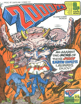
As a master of iconic single-panel imagery, you’d think Greg Staples would be a legend at covers over on 2000AD and the Megazine. You’d be right! He's one of the top covers contributors, with at least 75 cover credits across various formats. A small selection...

This one is rather Bisleyish, I'll admit.

Equal opportunities sexy times

Love those veins

You know who has a back like that? Sylvester Stallone, circa The Specialist.

I miss Nikolai Dante's mecahnical flying chess knight

Staples would be amazing on ABC Warriors.

None more Dredd

It’s mostly through his covers that Staples has maintained a regular presence in the Prog since he got his first break. I guess within the pages he’s forged a place for himself as a Dredd artist, but he’s turned his hand to plenty of other strips, too, and it always seems to fit. I'd love him to him work on Strontium Dog one day. Obviously not going to happen, but he'd be a fun way to go if Carlos decides to quit.


With Greg Staples, you know you’re going to get something gorgeous, with fun poking in from all sides.

More on Greg Staples:
His own website
A dissection of his art on Dark Justice
Covers uncovered had him on for one of his all-time best ever covers
An old interview on House of Betty
An a super-old interview about his Magic the Gathering work

Personal favourites:
Judge Dredd: Rough guide to suicide; You are the Mean Machine; Mad City; Dark Justice
Slaine: Name of the Sword; Beyond
The Clown: his parts of Book II look amazing. I can’t in good conscience claim I enjoyed the story overly much. (Book I, on the other hand, that’s a classic)
Sinister Dexter: Drop Dead Gorgeous; The Whack Pack;
Rogue Troopers

The DC/Rebllion reprint years weren't great but this one cover suited the glossy look perfectly.
*The final series featuring Friday and Venus Bluegenes, wrongly credited to Alex Ronald over on Barney. An incredibly rare error from them!

**A game I found myself playing with a few colleagues at work for the first time about a year ago. It’s surprisingly fun, although I get the impression you have be something of an obsessive to have hope of getting good at it. And yes, the art is pretty fantastic, with Staples one of the better contributors.

Friday, March 11, 2016

No. 62 Brendan McCarthy


First Prog: 82 (unless his Dredd from the 1979 Annual was commissioned or published first?)
Final Prog: 1784 (strip work) 1958 (cover)

First Meg: 3.33 (or 136 in normal numbers)
Final Meg: 311 (strip work); 329 (cover)

Total appearances: 165
-including his work for Revolver, but not Skin, which was meant to be but didn’t actually get published in Crisis.

Creator Credits:
Sooner or Later; Rogan Gosh; Zaucer of Zilk
Zenith (he designed many of the characters)
ABC Warriors (1 Warrior in particular)

Other art credits:
Judge Dredd
Strontium Dog
Walter the Wobot
various Future Shocks / one offs


Notable character creations:
 Zenith (main character design, and a bunch of supporting characters, too)
The Judda
Steelhorn aka the Mess
Brit-Cit Judges in general, Judge Armour in particular
Oz Judge outfit design (I think?), maybe even the Hondo City Judge outfits, too?

McCarthy during an especially experimental phase.
Colin MacNeil drew the story inside, anyone know who designed the uniform?


Notable characteristics:
Style; fun; characters who are more interested in having a good time than in doing the right thing, deliciously flamboyant colours; pizazz, if that a word anyone still uses;
amazing lettering; chunkiness; a particular sense of fashion

On Brendan:


This is my favourite ever piece of reader art. It just sums up the artist’s approach so neatly. He’s idiosyncratic, he’s heightened, he’s not afraid to just pull everything up at the corners and loosen things up a bit, you know?

It also neatly gets across the fact that although there are and always have been many distinctive artists at the house of Tharg, somehow McCarthy in the late 80s was the mostest distinctivistest. Especially on Dredd. It wasn’t just his take on Dredd, it was his approach to the whole city, and the way he had of drawing rain, and fear, and a general sense that just reading his strips might be enough to engender a classic case of ‘future shock’ (that’s to say, the in-story medical condition that causes people to go mad because they can’t cope with their own contemporary normality).

Frankly, I was scared off. I was super excited by the idea of Brit-Cit when Atlantis was on the cover…

Such vibrant design!


But I couldn’t quite wade through the actual strip (at the time), because the art itself was kind of off-putting.

Actually, this is from 'Riders on the Storm'. But it's scene-setting and scary.
Like, if this was a video, young me would know from the design that it's a 15 or even 18 rated effort.
Words by Wagner & Grant

I was, at that timek, mostly drawn to the likes of Ezquerra, Gibson and Belardinelli. Greats all, and, l.ike McCarthy, utterly idiosyncratic and not like any other comics artist, but they did have on-thing in common not shared by McCarthy: their work is always easy-to-read! The Witness, the Dredd two-parter that began in the legendary Prog 500 was a step too far – but at least that story was actually supposed to be frightening!

So much steam and sweat; the fear oozes off the page.
words by Wagner & Grant
Weirdly enough, Sooner or Later, which ran around the same time, was a comforting read. I mean, the story made very little sense to 8-year-old me, who barely knew what unemployment was, let alone the importance of good grooming. But the art was a burst of wonderful colour and whimsy and evil barbers with insane hairdos. The lettering on the ‘next Prog’ captions was an especial treat.

So much fun with the sound effcts and emanata!
Words by Peter Milligan


It's the Todds! Best hair-based villains ever.

I’m getting ahead of things. I tend to end up being dreadfully chronological in these write ups, and McCarthy had in fact been working for the Prog pretty much since the beginning. A cover here and there, some Walter the Wobot episodes, a bit of pitching in on Dredd, but most notably, a couple of one-offs from the early Annuals and Specials, which proved that he was pretty fully formed right out of the gate. Although I would say that McCarthy's early (and to some extent his later work too) feels very informed by British humour comics, in a way that much of the rest of 2000AD seemed to be striving to be more European or American.

McCarthy is co-credited with Brett Ewins, his long-term chum.


Dredd on his downtime, something we used to see a lot more in the early days.
This story may even have been written by McCarthy; not sure.


This page is right out of the Beano if you ask me.
McCarthy filling in from Carlos Ezquerra on a really early Strontium Dog.
Words by John Wagner
  
Most terrifying robot EVER.
Words by Pat Mills
Then he was plucked by Mr Mills to tackle a couple of early episodes of ABC Warriors. Including the introduction of cross-dressing as a theme.

Larking around with Happy and Joe.
Words by Pat Mills

I’m sad that he never got to do any more in that series, there’s something about his robots that delightfully fleshy that is rather unlike most other artists. I think he’d be a great fit for a comic about the adventures of the Geminoid lot.* The saddest thing of all is that, having introduced the Mess as a terrifying burning liquid metal robot, he never gets unleashed again.

Some more one-offs followed, including steamy robot action, 

Cracking design for the world's first robot.
Words by Gary Rice

 and of course a well-loved Future Shock with Alan Moore.


Every panel of this strip is a delight.
Words (and no doubt detailed panel descriptions) by Alan Moore

I guess he was kinda busy doing his own thing with Freakwave / Paradax / who knows what, but it’s weird to me that he never got a steady series until he became a Dredd regular in the mid 80s. Maybe he was too off-beat for the publishers at that time? Still, he had a good run on Dredd, a bunch of AMAZING covers, and of course the lunacy of Sooner or Later, the strip that saw him team up in 2000AD for the first extended run of work with long-time friend and collaborator Peter Milligan.

Who doesn't have this cover in their top 10? Anyone?


It’s worth dwelling a bit on Judge Dredd: Oz. The story goes (well, a story I’ve extrapolated from the interview he did on the Thrill Cast) that he spent some time bumming around in Australia, doing a bit of surfing, and he rang up John Wagner and told him a future Australia would be a great setting for a Dredd adventure. Somehow involving both skysurfing around Sydney and also going to Ayers Rock Uluru.

Wagner and Grant responded by setting up two entirely unrelated stories and mashing them together, allowing Chopper to muck about in Australia, drawn by an enormous variety of artists, while McCarthy got to design Morton Judd and his Judda, who terrorises the Judges in MC-1 while coming to a sticky end in Ayers Rock.
The hall of Judd
Words by Wagner & Grant

The Judda stuff ended up setting a major chain of events in motion, ultimately leading to Necropolis and arguably starting a domino topple of continuity that continues to this day (although I suspect it’s not too hard to make an argument that dominoes have been toppling pretty much since the Robot War, or maybe Sov aggression on Luna-1). 

This is how angry Judd gets in a flashback. Think how bad it gets in the present day
after he's turned full megalomaniac!
Words by Wagner & Grant


ANYWAY the Judda sections are slightly incoherent, but they’re stylish as heck. Morton Judd literally froths at the mouth at one point, before spontaneously combusting.

And, pretty shortly thereafter, farewell. A couple more Dredds, some covers, and then goodbye to 2000AD (on the whole), hello to sister publications Crisis and Revolver.

Some occasional updates on his efforts in Hollywood fleshing out Highlander II: the Quickening. Which I have seen and remember nothing about, except that every time I’m reading a back Prog that shows a snippet of McCarthy’s concept art I immediately want to watch it again, even though I know in my head it is a boring film.
 
Luckily, his other bigSci-Fi film turned out alright in the end! And isn’t it very 2000AD in feel.

Anyway, McCarthy was, for me, the poster-boy of what late 80s grown-up comics meant. They weren’t titillating or sweary or hyper-violent (that last but was already pretty well sewn up by 2000AD anyway). No, they were crazy weird, and revolved around real-world adult concerns such as ‘what’s the point of life?’, ‘running away from conformity’ and ‘how can I have a bit more fun?’.

Grown-up comics = comics about needing money and/or a job.
Words by Peter Milligan
I’m not entirely sure how I got wind of Skin, a Milligan/McMcarthy piece that as supposed to run in Crisis, but it sure piqued my interest. As it ended up being published by Tundra, it doesn’t strictly belong in this blog, but here’s a sample anyway. And yes, it should remind you of ‘This is England’. Only with added thalidomide**.

Note the super-different art style.
Words by Peter Milligan
  Certainly Rogan Gosh, which absolutely does belong on this blog, was the only reason I had any interest in picking up Revolver (which I didn’t at the time). No offense to Milligan, whose words and story are fascinating, but it’s the Brendan McCarthy show all the way. Colour at its most vibrant, and the boredom vs delight dichotomy of the story is made stunningly real by the images. There’s a case to be made for this being one of the most comic-y comics of all time, and it’s one of the closest examples I know of that captures the feeling of reading a poem in comics form – as in, the art itself has poetry about it, not just the words (which are prose anyway).***

A man about to enter a dream sequence
Words by Peter Milligan


A man in the midst of a pseudo-epiphany
Words still by Peter Milligan. He's good at words, isn't he.

And then that really was it for McCarthy and Tharg, aside from checking in with some more gorgeous covers from time to time.


For about 20 years or so.

And then, out of the blue**** came Zaucer of Zilk. One wonders whether McCarthy finally had a free window to draw some more comics, or whether it was in fact a character he’d had in mind for years, waiting only for the right scripting partner to come along. Enter AlEwing, who certainly put his own stamp on the story.

McCarthy's heroes are kind of dicks, no?
Words by Al Ewing.

In a way, Zaucer of Zilk is the most McCarthy story ever. You’ve got an idle, slightly irritated if not angry young man. Who cares about how he looks. Who gets into inter-dimensional shenanigans, and interacts on a meta-textual level with pop-culture references. And doesn’t so much have an adventure, as float from scene to scene, pointedly not learning any lessons.

This page wears its heart ell on its sleeve: our bored hero take a pill
to escape from dull, rainy life into techncolour adventure and glory.
Words by Al Ewing


All lavishly illustrated with oozingly beautiful colours (tip of that hat to Len O’Grady who must have rubbed his head a bit at the challenge of adding colour to an already-coloured McCarthy page of art!).While it didn’t ultimately engage me all the way, it sure brightened the Prog, and I’m always keen to see more of this sort of thing.

McCarthy has been part of the Prog since the very beginning, and remains part of the Prog today - or at least, one hopes he’ll come back. As one of the most visibly innovative and out-there artists of his generation, he stamped a mark on 2000AD pretty much every time his work has been printed. Without nudity or violence, I’d credit him as much as anyone with the shift of 2000AD out of the juvenile division and into the world of comics for everyone.


More on Brendan McCarthy:
His own website
Interview on the Thrillcast
The Strange World of Brendan McCarthy, a now closed blog dedicated to the man himself

Personal favourites:
Judge Dredd: Dr Panic; Atlantis; Witness; Oz; Report to the Chief Judge on the Accidental Death
ABC Warriors: Steelhorn
Sooner or Later
Rogan Gosh
Robo-Tales: Ye Firste Robote


*I happen to be working on a book about robots in my day job at the moment, so I’m up on my robot tech. Geminoids are the super-uncanny-valley androids with fake skin.

**Last Century’s zika virus, only worse because it was man-made and actively pushed onto pregnant women. Brrr.

***Massive digression, but another great example of a comic that functions as a poem is Richard Maguire’s Here. And just maybe some of Steve Ditko’s Dr. Strange, which was for sure an influence on young Brendan.

**** pun absolutely intended for this bluest of comics.