Friday, May 11, 2018

No. 112 Rufus Dayglo

First Prog: 1359
Latest Prog: 2072

First Meg: 216
Latest Meg: 297

Total appearances: 81
-including his run on Tank Girl in the Megazine.

Creator credits:

Counterfeit Girl

That is some funky costume design right there.
Words by Peter Milligan

Other art credits:
Judge Dredd
Tank Girl
Bad Company
Various one-offs

Notable character creations:
Dan Francisco
Libra (or whatever the correct name is for the Counterfeit Girl…)

Notable characteristics:
Well, the man wears his influences on his sleeve, quite literally.* He’s something of a 2000AD superfan, or at least, a superfan of 2000AD art and artists, which isn’t that uncommon in creators who started working for the Prog at any point after the early 80s, but not many have curated exhibitions of the stuff!

In terms of Dayglo’s published styles, it’s Mick McMahon and Brett Ewins that shine through as his favourites. I mean, I thought I liked Ewins’ art, but my love’s got nothing on Rufus Dayglo. It is utterly appropriate, but also deeply sad, that he drew the official 2000AD memorial tribute.

  
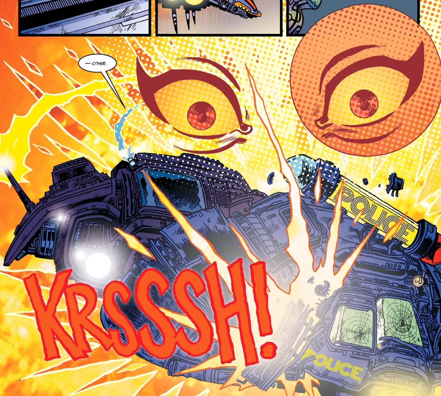
But Dayglo has his own thing going, too. Pop Art. Going big. In your face. 

A little Cam Kennedy going on here, n'est-ce pas?

Attitude. Chunkiness. Embracing the artistic worth of empty space.
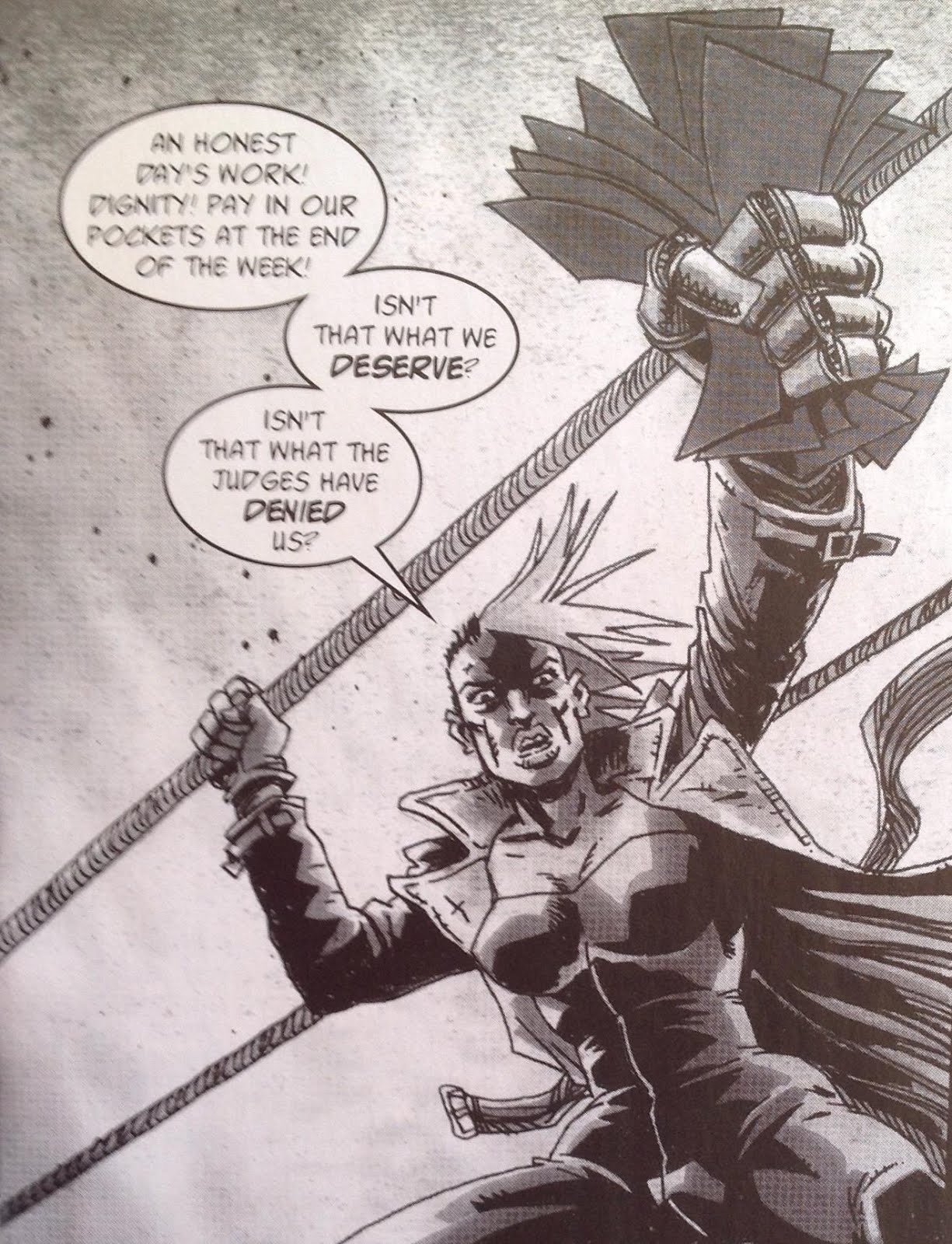
This, for me, is pure unfiltered Dayglo.
Words by Rob Williams
  
On Rufus:
Now, Pop Art is something of a dirty word** in the world of comics, since it originally applied to so-called fine artists who appropriated comics panels, either copied or redrew or them, or used them in collages, and presented them to a ‘refined’ world of art lovers who didn’t read comics and thought of them as trash. But, for all that, the likes of Roy Lichtenstein in particular added a hint of style that emphasised the heightened, fake reality of most comics, most obviously by drawing out the little coloured dots that were, once upon a time, the way that comics were printed. And, speaking for myself, I encountered this art at an age far too young to know or understand the troubling backstory, and loved it from the word go.

So, it’s with great admiration when I say that I find Dayglo’s art (on some stories more than others), has something of that style about it. He’s not afraid of his comics looking like comics, and of his characters looking like people who live in a world of comics, rather than in the real world.

The faces, the stances, the explosions, the glorious dots - it's all so COMICS.
Words by Alan Martin

One of those glorious melanges of action, sound, emotion and such that you can really only achieve in the comics medium.
Word by Peter Milligan

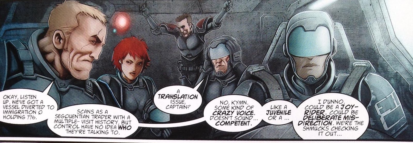
And boy howdy, is this ever my kind of thing!

Feast upon the giganticness of Judge Dredd’s face as he bursts out of these two covers…


Marvel as Aimee Nixon dares you to judge her self-destructive impulses…

Words by Rob Williams

Taste the blood on crazy Mac’s machete as he prepares to strike you down…


As with so many artists on this tribute blog, Dayglo’s work has markedly improved over time. I think the first time I noticed his name in the credits box was on the experimental 2005 Winter Special, in which Tharg made a point of commissioning relatively untried writers and artists. Here’s a sample of Dayglo’s work on the story Earth War.


It's raw, but it sucks you in, in a good way. War is hell!
Words by Jaspre Bark
So it reminds me a lot of VCs / Judge Child era Mick McMahon. AKA big ‘effin boots to fill! If it doesn’t quite have McMahon’s impeccable layout skills, it does, I think, capture his no-holds barred attitude putting emotions and weirdness front and centre, not trying to hide anything.

In fact, Daylgo had illustrated a Future Shock a couple of years earlier, very much the work of an artist in training, but with that bold body-language already in place:

Words by Jaspre Bark


 More McMahoniness followed this in Whatever happened to Giant, in which the original John ‘Giant’ Clay meets Judge Giant (Jr), a poignant tale set largely in a care home.***

A genuinely touching story.
Words (if you can read them through the blurry scan; sorry) by Gordon Rennie
Dayglo’s first Dredd story came not long after, and it’s a cracker, introducing no less a major character than Dan Francisco. There’s still a McMahon thing going on (and why not, if you’re tackling Judge Dredd), with maybe a hint of Cam Kennedy creeping in (again, why wouldn’t you). But, more than those influences, there’s that big, bold attitude again. The one that says, ‘yes, I will draw a MASSIVE eagle badge with a 9-letter name on it’, and that isn’t afraid to have its hero bleeding out in the foreground of a giant panel.


This time Dayglo is channeling a touch of late-period McMahon
Words by John Wagner
For his first longer run, Dayglo tackled one of the serious, Aimee Nixon focussed episodes of Low Life, the Megazine story War without Bloodshed. I relished the opportunity to wax enthusiastic about it with Eamonn Clarke on his glorious podcast, but it’s worth repeating: this story is awesome! And it’s THE vital link in the chain that gets us from the Aimee Nixon of the first Low Life strip to the Aimee Nixon of Titan.

This panel really communicates what it feels like to have Dredd getting up in your face - and he's meant to be on the same side as Nixon!
Words by Rob Williams

An emotional turning point for Aimee Nixon? The negative space, man, it's all in the negative space.
Words by Rob Williams

Having got well into the good graces of 2000AD fans, Dayglo accepted the gig of drawing all new episodes of Tank Girl for the Megazine. 


He brought with him an all-new style – multiple styles, indeed, to match the series. It’s not so much Jamie Hewlett, more classic Beano/Dandy art but tailored for adult readers. And the art is, on the whole, very good. The stories, sadly, were not. I liked the one that showed Tank Girl’s school days (which look back not just to the Beano, but also to Ronald Searle's St Trinian's cartoons and Molesworth books)

Kids rool OK
Words by Alan Martin

Is there anything more British than a church fete?
Also, that helmet may reference Terry Gilliam, but it puts me more in mind of The Dandy's own Caning Commando, 14th century schoolmaster/knight 'Whacko!'.

and there was some goofy fun in the giant Death Race 2000 / Wacky races bit
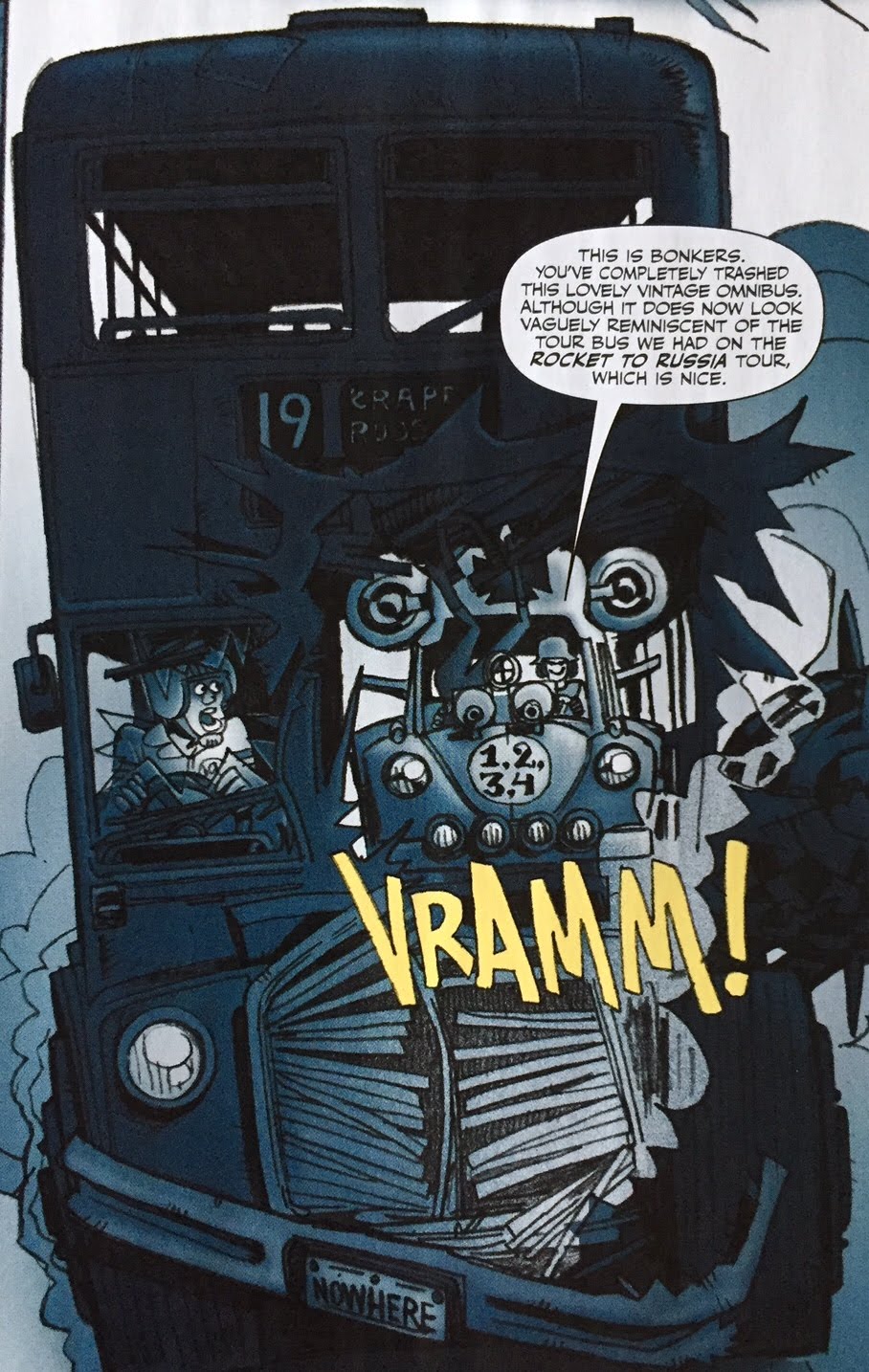
I used to get the Number 19 bus to work when I lived in Finsbury Park. Fun fact.
Words by Alan Martin
 – but frankly, the humour wasn’t even slightly of the Wagner/Grant school that we’ve perhaps got a bit too used to. OK, that's not entirely fair - this exchange between Booga and a psychiatrist is epic:

Simple but effective, and sold strongly by the layouts. Nifty.
Words by Alan Martin
Readers (or at least, a small but vocal group of online commentator readers) did not care for it (to put it mildly), and, for a time, meant that Dayglo was somewhat soured on all things 2000AD. I can’t imagine a feeling much more heartbreaking than having fans who share the same passion as you hating on a project you’ve spent months (years?) of your life on.****

It would be five long years before Daylgo returned to the Prog, with a glorious in-your-face cover, and not for the most obvious of stories…


…and then, the unexpected return of those old future war favourites, Bad Company. No Brett Ewins to draw it, so Dayglo took on his friend and mentor's role as penciller, with original inker Jim McCarthy adding the classic Bad Company touches.

Continuing series tradition, Kano has a further facial hindrance to cope with  this time having half his face - and half his brain (but which half?!?) blown off.
Words by Peter Milligan
As much as anything, First Casualties was a love letter from Milligan and especially Dayglo to their old pal Brett Ewins. And as such it’s a roaring success. There have been some (valid) complaints that the storyline here does not seem to line up at all with the events of previous books of Bad Company. But for some reason, this hasn’t bothered me. The creators managed to recapture that essence of lunacy combined with the politics and emotional cost of war that feels like Bad Company used to feel. Sure, the plot isn’t as compelling as the original, glorious run, but it’s a treat in its own right.
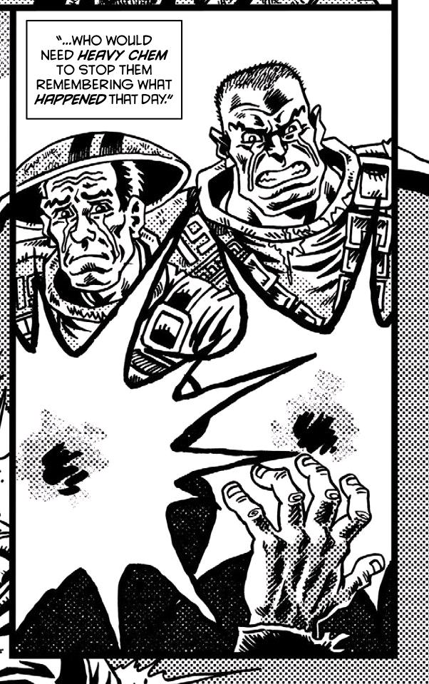
Those de-lovely dots again!

If I didn't know otherwise, I'd swear this was a scene right out of the first book - but it's no copy, just a perfect recreation of style and tone.

Terrorists, while once again not tying up the plot part, hews even more to the feel of the old days, partly thanks to Dayglo’s art now being splashed with the most insanely vivid colours courtesy of Dom Regan. Plus, Mac’s back! I love Mac. But it's also much more Dayglo's own thing, following Ewins's original designs but not his drawing style. Dayglo's slightly looser, almost plasticine body textures getting their due.

You feel that Kano could literally squeeze Thrax into some sort of paste here.
Words by Peter Milligan

Mac's back to save the day.
Words by Peter Milligan
I’m hoping the revived Bad Company has proved popular enough, twice now, to merit further adventures of the Old Soldiers, but you know what I really want from Dayglo? More Counterfeit Girl.

As expressed by Tharg, this series, which debuted in the almighty Prog 2000, was designed to showcase 2000AD’s commitment to new stories, as well as old favourites. For his part, Dayglo had quite the task to achieve, creating a future Britain that had familiar trappings but was also gonzo weird, and also dreaming up Libra, a character that we know we can’t trust, but also that we have to feel sympathy for. And, more than that, Dayglo had to make her get more and more ill with each passing episode, a narrative trick that could stand to be used more often in comics, it’s quite a nifty visual. (With a special mention again for colourist Dom Regan, going bold with his choices to match Dayglo's ever-bold layouts)

Barely time to pause for breath in the frantic life of a girl on the run.
Words by Peter Milligan

One way to make a protagonist more sympathetic - pit them against dastardly villains.
In this case, a Judge right out of Spitting Image (a noe-more Britihs reference point), and, for my money, channelling caricatures of both Margaret Thatcher AND Tony Blair.
Words by Peter Milligan

This is the part where I usually talk a little about what a story is actually about, and how the art builds on that. The task might be beyond me. I mena, clearly the overt text is about identity theft down to the genetic code, married to Sci-Fi staples of ‘mind-as-information’, and ‘identity as data construct in an uncaring bureaucratic world. And I guess there’s a bit of subtext about teenagers struggling to develop their own identities, in part through running away from loved ones and in part through copying other people.

But I don’t know that I really understood everything that was going on. I just know that it looked damn cool! 

You just don;t want people who travel with floating eyeballs looking for you.
Words by Peter Milligan

And I could do with more – g’wan Tharg.

More on Rufus Dayglo:
His blog
His Twitter
Talking to Molch-R about Bad Company on the Thrillcast


Personal favourites:
Judge Dredd: The Streets of Dan Francisco
Low Life: War without Bloodshed
Bad Company: Old Soldiers, Terrorists
Counterfeit Girl

Art by Cliff Robinson - but, based on those arm tattoos, Mr Dayglo himself was the artist's model...
*Rufus Dayglo has more 2000AD tattoos than you.

**Two words. You know what I mean.

***A consistently good setting for 2000AD stories, bizarrely.

****For my money, the major sin of this Tank Girl run was that it went on too long – if it had had like 5 separate 3-4 month stints it might’ve gone down a lot better. That said, it just wasn’t weird or funny enough, and I can’t put my finger on why.

Friday, May 4, 2018

No. 111 Lee Carter


First Prog: 1538
Latest Prog: 2058

First Meg: 356
Latest Meg: 380

Total appearances: 81

Don't mess with Uriel
Words by Tony Lee

Creator credits:

Dead Eyes*
Necrophim**
Angelic***


Other art credits:
Judge Dredd
Grey Area
Indigo Prime
Rogue Trooper
Terror Tales
But, astonishingly, no covers. What?

Notable character creations:
Danny Redman & Unthur Dak (from Dead Eyes/Indigo Prime)
Uriel (the lead from Necrophim)
Young Pa Angel

Unthur Dak has been around longer than you.
Words by John Smith

Notable characteristics:
Georgeous realism. Astonishing Ugliness. Filmic compositions. An impressively grim imagination. And, something very specific in the way he draws people’s faces. They’re kind of bumpy, with fleshy jowls and rugged chins.

Carter's art mixes the spectacularly real with the offness of 2000AD.
Words by TC Eglington

Rugged action heroes who police the Grey Area
Words by Dan Abnett

I would also say, not controversially, that his work lends itself to horror, including the horror-end of the thriller genre. It's been three decades since grandmaster of macabre art Kevin O'Neill was told by DC Comics that his entire style was just too grim for children - I reckon Carter has a shot at being rejected by major US comics publishers for the same reason!


On Lee:
All artists have their inspirations, but I damned if I can spot Lee Carter’s. His work isn’t like any other comics artist I’ve come across (not that I’m some Paul Gravett-level expert on comics history, you understand). Maybe, if you squint a bit, you can see some Chris Weston in there. But that’s mostly because both have worked on Indigo Prime specifically, and also because both seem to delight in painfully detailed rendering of the human form, often merged or surrounded by some horrifically weird goings on, tinged with depravity.

With that in mind, it’s no surprise Carter’s first work for Tharg was on a Terror Tale.

No the first time vampirism has been visually compared to drug addiction, but rarely has it looked so squalid and felt so tangible. 2000AD - share it with your kids!
Words by Arthur Wyatt
I repeat, I don’t know anything of Carter’s process, but in this early work I’m pretty sure he used real-world photos – often of deliberately seedy or squalid places, presumably that he took himself – which really help get the tone right. Carter’s people, whether photo-derived or not, are very much comics-art people, with a hint of otherworldliness to their face and skin. Or maybe that’s just the vampire/drugs/death metaphors at play.

From there, Carter moved instantly to a brand new series, Dead Eyes. It followed the exploits of soldier Danny Redman, recovering from a combination of war trauma, hospitalization and indeed experimental procedures. The whole series had a palpable sense of everything just feeling a bit off, right from the opening episodes, even though they were very much grounded in the real world of contemporary England. Carter’s art is super real-world in look, as before, with causal, low-key details thrown in (especially the clothes and the pubs. Carter might be 2000AD’s best drawer of pubs).

The skin seems to hang off the bones, even as the whole thing feel dead real.
Words by John Smith

Being a John Smith tale, the offness eventually comes to the fore with stone circles, apocalyptic visions and telepathic Neanderthals. Carter keeps up the pace admirably! And all along he keeps us inside Danny’s head as he goes through various states of understanding of what the hell’s going on (see also later work on Indigo Prime).

What are they doing? Treppaning, Mesolithic style!
Words by John Smith

From there to Necrophim, a 2000AD series I want to like a lot more than I actually do, that remains pretty unique to the comic – it’s a tale of political intrigue and machination set in Hell (with occasional detours to Heaven), put together by people who presumably know the basic plot of Milton’s Paradise Lost but, much like me, have never actually read it.

At the forefront of it all is Uriel, a fallen angel (one of the Necorphim, as the story has it), a loyal acolyte of Lucifer – the ex-archangel who rebelled against God and lost, but was granted dominion over Hell. In this story, Uriel is essentially honourable and decent, while Lucifer is a washed-up half-evil but mostly selfish imbecile (one of the sour points of the overall story, for me).

Lucifer - all-around preening areshole.
Words by Tony Lee
Never mind that, from episode to episode this is all kinds of fun, starting with the character design and setting. In the halls of Hell, depravity rules. Think Clive Barker’s Hellraiser for inspiration, but Carter really shines on his demon designs – weird enough to be memorable, but not too grotesque to get in the way of the story.

IN the halls of Hell, crucifixion is an idle diversion. Who's side will Uriel take?
Words by Tony Lee
If you look carefully, there’s a constant stream of casual horror going on in the background, a bit like behind the scenes of a Hollywood film set if the likes of Harvey Weinstein were allowed to openly indulge in the evils he is accused of. In other words, super not okay in real life, but utterly appropriate for a depiction of Hell. All that said, I kind of wish Carter had either allowed himself, or been encouraged by Tharg, to go even further into the depraved stakes. It’s not as bonkers as John Hicklenton, but at times it does approach that ilk – in content, if not in style. Necrophim needs to be a bit repellent to work, and a lot of the time it succeeds.

On the other hand, this is another Tony Lee scripted series in which lots of panels involve people walking and talking. Like Jon Davis-Hunt before him, Carter does what he’s told, but apart from the character designs and background setting, he doesn’t quite manage the trick of keeping the chat pacy. 

Casual beheadings are awesome!
Words by Tony Lee
And it doesn’t help that all the characters are constantly and only aiming to betray each other, making it tough to put much emotion into the faces as the only emotion, really, is ‘I hate you and think I’m cleverer than you’. I’d say this works for ‘hero’ Uriel, and for Lucifer’s chief minion – the Spike to Uriel’s Buffy, if you like – but for everyone else it gets a little trying.

Necrophim had a good run for all that, and it certainly allowed Carter to build up his storytelling confidence. Which was brought to bear on a touch of Dredd, and some early Grey Area. A lot of classic hard-man (and woman) chin action going on! 

Don't mess with the chin!
Words by Gordon Rennie

I feel like I've seen other artists achieve that armour texture before - Adi Granov, maybe? - but it's super effective.
Words by Dan Abnett

And yes, a bit of people standing around talking to each other - but he's getting better at tackling this already. I'll admit I'm not the biggest Grey Area fan, but I do appreciate how the creators always make it feel very near future - apart from the aliens, the cars, armour, guns and of course attitude all seem as if they're just a couple of years ahead.

Look at that dining room - right out of a catalogue! And yet, the texture and everything just feels menacing.
Also, there's a spooky alien beastie in the foreground. That helps.
Words by Dan Abnett (I think?)

For me, Carter’s art stepped up to another level on his next major assignments, Indigo Prime and Angelic. A lot of this is the colouring. Again, I’ve no idea what process he uses, but it’s impressively bright and clean, and just all-around effing gorgeous to look at. Angelic is something of a Sci-Fi western****, and the landscapes are a crucial part of that genre. Scorching skies, lonely mountains, dusty towns – it’s all there, all somehow helping to make Pa Angel a more sympathetic figure than one thought possible.

Pa Angel - hero?
Words by Gordon Rennie


Extra points fro being able to draw a realistic toddler, but always keeping an eye on the rocky backdrop. Amazing!
Words by Gordon Rennie

Revving up for all-out action...


Now THIS is classic 2000AD - fill up a panel with so many weirdos they don't even fit, with no detail spread on muscle, facial expression or outlandish outfits.
Words still by Gordon Rennie

Indigo Prime is another thing entirely. Once again, Carter delivers pristine and surprisingly shiny visuals, but it’s all in service to putting the reader into another space, another place, where the weird and startling can and do assault the characters at every turn. There’s also a neat mix of characters, who are by turns overwhelmed (Danny Redman, usually), or ultra-cool, or beyond cynical. And, of course, there's the colour - such glorious colours!

Bright pink everywhere! Must be some hardcore, fun-lovin' hedonism going on.
Context by John Smith (although that'd have to be a hell of a panel description to have nailed down all those details; gotta assume Carter unleashed his own imagination on this one, too.)
And yes, that is a barrow-boy selling seal pups in the middle there.

Green, grey and dusky pink - must be an evil mad scientist at work.
Words by John Smith

Uh-oh - that pink's gone purple - things have taken a turn for the worse.
(although the dangling pig's head helps telegraph that too)
Words by Kek-W

I guess everyone knows what black signifies.
Carter shows off his facility with panel layout - something he's learned over 5 years of hard work.
So horrific, but utterly absorbing and effective.
Words by Kek-W

There was some controversy over the latest series of Indigo Prime, which saw John Smith handing the writer’s baton over to Kek-W. Not entirely by choice. At least everyone, including Mr Smith, agreed was that Lee Carter’s art was too good to leave in limbo forever. Smith may have wanted to take his tale in a different direction, but he’s a generous soul, and frankly us readers were the winners here, as the unpredictability and many levels of the world of Indigo Prime continue to be unlocked. And Kek-W doesn't skimp on the character beats either.


Let’s end with a sterling but so far unrepeated Rogue Trooper outing from the 2014 Winter Special. It’s a cracker!

Funky panelling combing with a funky, grimacing chin - it's ultimate Carter
Words by Guy Adams
And, at the time of writing this, word has recently broken that Carter is soon to be tackling Durham Red. He’s got form with vampires, signs are v.v. promising!


More on Lee Carter:
He Tweets!
(note the amazing profile picture of Dredd, with characteristic bumpy Lee Carter chin)
He's on Deviant Art!
(where I pulled some of the better panel images from)
A super-early interview on Thunder Chunky, from his pre-2000AD work in the small(ish) press world. Top quality even then!
A review of Dead Eyes in Starburst
(from the Indigo Prime collection)


Personal favourites:
Dead Eyes
Necrophim
Indigo Prime: Perfect Day, A Dying Art
Angelic


And finally…
There’s surely more than one Lee Carter in the UK. But might this piece of reader art from the early 90s be the work of the same man? It’s pretty damn good for fan art!

Foolishly, I did not make note of the Prog number this came from.

*OK, so technically this series ties in with an older one co-created by Chris Weston. But frankly the setting, tone and indeed all but two cameo characters, this is all Carter.

**Carter drew the entire series, but Simon Davis painted the first cover, and I wonder if he had a hand in the basic angel/demon design..?

***Yet another test case! Clearly, the look of Pa Angel and his ‘family’ was long established by Mike McMahon, but this series is just enough of a re-invention, again in terms of tone and setting, that it sort of feels fair to call it a ‘creation’.

****Gordon Rennie loves a classic western, one suspects.