
First Prog: 646 (on the cover), 718 (interior strip)
Latest Prog: 1737 (on
the cover), 1126 (interior strip)
First Meg: 1.02 (on
the cover), 1.07 (interior strip)
Latest Meg: 285 (on
the cover), 3.45 (interior strip)
Total appearances: 100
Including a whole bunch of
work on Crisis; not including a one strip for Daily Star Dredd, which I’m very
curious to see. And it probably should include a count for his time as designer on the Megazine, credited to "Mr and Mrs Phillips" for Volume 1.
 |
| This may have ben intended as the cover for issue 1. That's Phillips's logo design, too. Nifty! |
Creator Credits:
Danzig’s Inferno
 |
| Dinosaurs and giant robots were not Phillips's forte. Words by Alan McKenzie |
Devlin Waugh
Other art credits:
New Statesmen
Third World War
Judge Dredd
Sinister Dexter / Downlode
Tales
Armoured Gideon
A handful of one-offs
Notable character creations:
Armitage
Treasure Steel
Devlin Waugh
Treasure Steel
Devlin Waugh
Brit-Cit Judge Stark (from the Hunting Party, and later the Doomsday epic)
Notable characteristics:
Chunky limbs and gigantic chins. Well-tailored characters. Proper fine-art sensibilities, with gorgeous attention to anatomy. A radical shift in style from lush paintwork to super-sparse linework. But married by an unerring sense of design, in terms of page layout, panel layout, and generally guiding readers' eyes all over the place.
 |
| Someone's been studying the use of triangles in Rennaissance painting... |
 |
| Love this piece as an example of figure work. |
On Sean:
Sean Phillips is yet
another creator who is now world famous, and whose work on 2000AD (and its
stablemates) is perhaps largely unknown to comics fans outside the UK. He
was also, evidently, something of a child prodigy a la Steve Dillon and Garth Ennis,
getting his first work as a teenager (on British girls comics, which were still
a thing back in the mid 80s). By the early 90s, he was
a proper rising star, called on to do quite big things such as designing parts
of the brand new Judge Dredd Megazine*, and creating major series like Armitage and Devlin Waugh (not that people could necessarily have predicted how
big a deal that second character would become, I suppose).
 |
| Phillips created Judge Pal, the original mascot for 'Judge Dredd the Megazine' |
Again pretty early in
his career, Phillips was called upon several times to deliver Prog covers for
the big anniversary and ‘jumping on’ issues, presumably because Tharg felt his style
had what it took to bring new/lapsed readers back into the fold, mostly via the barrel of Dredd's lawgiver! It's certainly eye catching and, in a way, very of its time. None of these are quite all-time fave contenders, but if you want to know what 2000AD looked like in the late 80s / early 90s, this is an excellent summation. To whit:


All this, weirdly, off
the back of his first published work for Tharg, in which he was obliged to do a
sort of Jim Baikie karaoke on New
Statesmen. Knowing how far Phillips’ style would evolve, it’s quite fun now
seeing the artist that he would be struggling against the artist doing his best
effort to try to be like someone else.
I would say that both
are tremendously dynamic, and give good fluidity, but apart from that they
couldn’t be more different. If I’m honest, my first reaction to Phillips’s work
– his early Prog and Meg covers – was that it was rather blocky, kinda
grown-up, and a little off-putting for that specific reason.
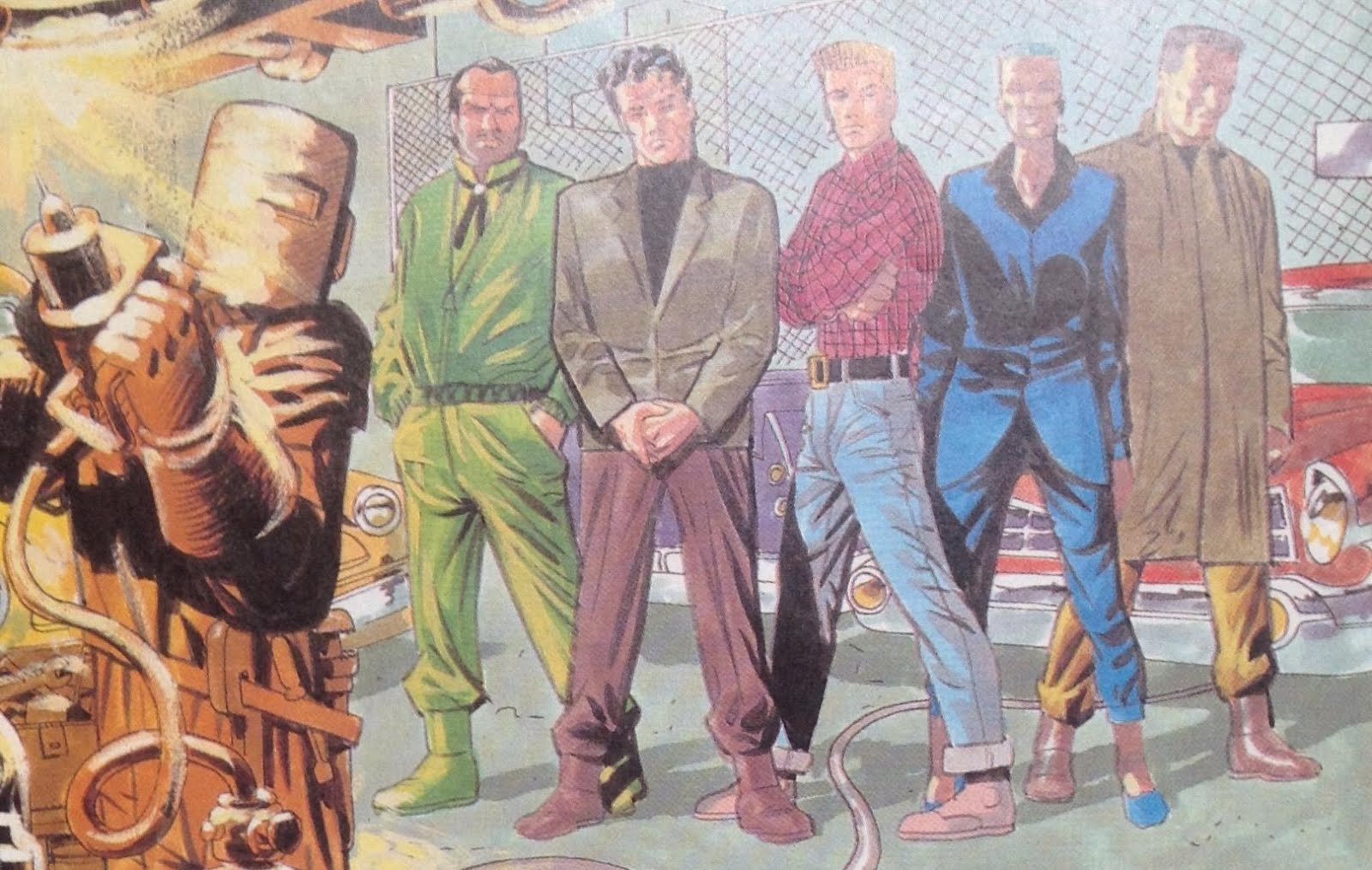 | |
| He's captured Baikie's faces perectly, and even the way he draws fabric. But the poses are pure Phillips, if you ask me. Context by John Smith |
 |
| Phillip's first Prog cover. Metal bars, pipes, skating refence, urban grit and squalor. It's so effing 90s it hurts (even though its' 1989). But it remains a powerful image. |
If I’d seen his work
on the later Third World War, where
he could do his own thing, I might have been more pulled in! And his run of
Crisis covers were proper artschool.
 |
| Painting with many textures. And perhaps one of the best kiss depictions in Tharg's output? |


But no, what I
actually saw next was Danzig’s Inferno.
 |
| Yup, that Sean Phillips himself in the middle, looking as confused as us readers. Words by John Smith |
 |
| More beautifully ugly pipes and wires. Words by John Smith |
And collage. You gotta
admire the experimentation going on, in Smith’s script as well as more overtly
in Phillips’s art.
Onto Armitage, then, the first Phillips
series I actually engaged with on any real level! Like a lot of Megazine
series, it took young me a while to realise what the story was actually meant
to be about - elitst corruption at the heart of Brit Cit government – where I’d
thought/hoped it was going to be a generic cop procedural. But that’s an
examination for another post. I would note that, bizarrely, one thing that
perhaps threw me off the scent was just how clear and delightful Phillips’s art
was.

You’ve got Detective Inspector Armitage, who is very obviously an Inspector Morse riff, only with more physicality. Then you’ve got Treasure Steel, his new assistant and our point-of-view character, who is not, to my knowledge, based on anyone in particular. They’re both, from the off, incredibly well realised. Dave Stone gets a measure of credit, of course, but there’s so much in Phillips’s way with costume design, body language, and above all facial expressions that sells it hard. I liked these characters from the start, and wanted to read their adventures.
 | |
| That is some gorgeous panel layout work right there. It really hits home the tension between the characters. Words by Dave Stone |
 | |
| The blocking here is kinda awkward and stiff-looking - and yet there's a dynamism to it all the same. Also, more mad msucles! Words by Dave Stone |
The more cartoonish
supervisor, Warner, and the too cliché pathologist (who at least has the decency
to end up being a vampire), threw me off a little, although again they’re
well-rendered by Phillips, who leaves the reader in no doubt as to how we
should read these characters (elitist oldboy prick and somewhat overly
efficient super-cynic, respectively). The setting of the New Old Bailey, too,
is a gorgeous mix of classical old and high-tech new, balanced by Armitage’s
embracing of old - but not elitist, classical old - and Treasure’s world of new
- but not establishment-sponsored new.
There’s a lot going on
in the setting is what I’m saying, so it’s a shame that first story itself is
merely OK. For me it’s the work of Phillips as much as Stone that gave the
series the legs it would prove to have (unlike, say, Red Razors, which even Steve Yeowell at the height of his early
powers couldn’t save from a story that disappeared up its own
self-congratulatory orifice).
Before moving on to
better things, let’s dredge up the early Megazine’s forgotten ‘comedy articles’
section, the Mega-City Times. I don’t
know exactly how much input Phillps had on this, but it was enough that he
appears himself, via photos and assorted silliness…


 |
| That's Phillips on the left. |
I’m glad that he,
MacManus (and presumably a young David Bishop) were having fun, that’s all I’ll
say.
Back in Armitage mode,
Phillips was an instrumental part of launching the Megazine volume 2,
introducing Devlin Waugh. Swimming in
Blood was arguably so well-loved it may have been what really put Phillips
into the stratosphere, setting on the path of international glory. Being a
contrarian, I didn’t like it much at the time. Oh, the art and story are both
well-executed, but I couldn’t quite see the fuss for riffs on Silence of the Lambs and Aliens (two films I happen to have seen
an embraced at almost exactly this time). But let’s acknowledge quite how well
Phillips delivers Deviln Waugh. Again, it’s all in the tailoring, the postures
and the expressions.
 |
| Such glorious tailoring! And that pose. Words by John Smith |
 |
| I occasionally forget that 'Swimming in Blood' is mostly a horror story. Then I stumble across scenes like this, which remain chilling and tense even as a singel panel. Context by John Smith |
Phillips is that rare
artist who has produced more pages for the Megazine than he ever managed for
2000AD itself. Plenty of covers on the Prog, and cracking ones at that, but not much on the
series front in Tharg’s flagship periodical.
Judge Dredd: the Marshal was his longest, in the Armitage/Devlin style.
 |
| Never afriad to fill up an awkwardly shaped panel with an extreme close-up. Words by Garth Ennis |
And then he seemed to
disappear for a few years. He returned with a radically different look, much
more relaxed, eschewing the paints altogether. I guess they weren’t so
fashionable then, or maybe it’s just that Phillips discovered he was quicker
without them, and perhaps more confident.
 |
| Words by Dan Abnett |
 |
| More immaculate panel layout work. Words by Nick Abadzis |
 |
| Shades of Phillips's noir comics to come? He certainly injected this Sinister Dexter outing with a ton of pathos, despite the series, at that time anyway, being largely a knockabout comedy. Words by Dan Abnett |
Special mention for his opening episode of The Hunting Party. Like Mike McMahon on the VCs, Phillips was tapped to create a bunch of new characters, and generally set a certain tone for the mini-epic to follow (a tone that was roundly ignored by the succession of artists, but no matter. It’s a pretty weird epic that matches the Cursed Earth for complete random collection of settings and stories).
 | |
| Once again, Phillips proves his mastery of conveying a whole lot of atmosphere and character with very simple basic ingredients. Context by John Wagner |
And I couldn't resist sharing this panel of Dredd giving a wealthy man a proper dressing down. So severe!
 |
| Who would win in a 'hard staring' contest - Dredd or Paddington?? Words by John Wagner |
 |
| And we always welcome the tmie he can spare for covers, too! |
More on Sean Phillips:
His website
His blog
A 10-year old, but
still interesting interview on the Forbidden Planet blog
-but I’ll be honest,
much of the recent stuff focuses on Phillips’s more recent work, not much about his time on 2000AD / The megazine, naturally
enough.
 |
| Words by Warren Ellis |
Personal favourites:
Judge Dredd: The Hunting Party
Armitage
Devlin Waugh: Brief Encounter (sacrilege, I know, but I never quite got into
‘Swimming in Blood’ the way so many readers did)
Sinister Dexter: Sucker Punch
Vector 13: Marion;
It’s good to talk
*One of the rare bits
of controversy explored in Thrill Power Overload concerns the feathers ruffled
when youngster Sean Phillips was given the kudos of designing the logo and
cover for issue 1 of the Megazine, only to have it given to ‘old master’ Glenn
Fabry at the last minute. I’m guessing his issue 2 cover would’ve been the
original issue 1?


