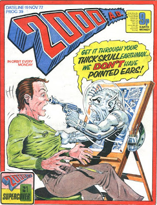
First Prog: 33 (as
cover artist); 37 (as strip artist)
Final Prog: 1277
Total appearances: 227
- not including any of his
work for Deadline magazine, which he co-founded and ran.*
Creator credits:
Bad Company
Other art credits:
Judge Dredd
ABC Warriors
Rogue Trooper
Anderson, Psi Division
Universal Soldier
Kelly’s Eye
plenty of one-offs, including a
bunch of Supercovers – an early experiment in which artists provided a sci-fi
cover and a writer somewhere had to concoct a short story to match (at least
I’ve always assumed it was that way around)
Notable character creations:
Venus Bluegenes
Major Magnum
Gargarax
Kano especially, but also Danny Franks, Thrax, the
Krool and really the entire cast of Bad Company and Bad Company II
Notable characteristics:
Chunky boots; thick
black lines; photocopying his own panels; punk-rock hairstyles; pointy noses;
dynamic poses; guns with holes in the barrels and various appendages. Monocles.
 |
| Real men wear thick-soled boots Words by Wagner & Grant |
 |
| Bad men wear half-glasses and make hand steeples. Words by Alan McKenzie |
 |
| Sci-Fi guns just should have holes and lines all over them. Love it. Words by Gerry Finley-Day |
On Brett:
Brett Ewins drew characters
to look the way 10-year-old me imagined stereotypical 2000 AD readers looked.
Which is to say, slightly sneery, gruff, tall men (and the occasional woman) in
their 20s / 30s, with long trench coats, spiky punk hair, who smoked
cigarettes, drank whiskey from the bottle (maybe wrapped in a brown paper bag)
and fully embraced the writings of Nietzsche, Camus and Sartre**. The sort of
people I’d have been scared of meeting in real life, but quite liked reading
about.
 |
| All hail Gargarax! Groan by Wagner & Grant |
I’m sure this says a
lot more about me than it does Ewins! Part of the same feeling also put Ewins
in that bracket of ‘artists whose work I most enjoyed copying’. His very stark
outlines, especially when it came to hair, gave me confidence to think I could
do it, too. Not that I had the imagination to produce the likes of Gargarax or
the cast of Bad Company.
Getting back to the
man himself, his story starts as part of the very first wave of new talent who
pushed hard to get work with 2000 AD. Most of the creators involved in 1977 had
come through the British comics establishment, or from European art agencies.
Ewins, along with childhood friends Peter Milligan and Brendan McCarthy, were
amongst the first of a new generation of creators to break into the comics mainstream
via Tharg’s Future Shocks. Ewins and
McCarthy then worked separately and together (inking and pencilling, maybe?) on
some Dredds, in a style reminiscent
of but not quite like the style either one settled into later.
My first vivid memory
of Ewins in what I think of as his natural style comes from as
Milligan-scripted Future Shock called
The man who was too clever, which I
read in a Best of 2000 AD Monthly reprint. Like a lot of classic 2000 AD, it’s
a bit noir, a bit Bladerunner (first
published some years before that
film, mind you!), and features a smug but redoubtable protagonist.
 |
| Photocopies, dots and Kirby Krackle - it distilled Ewins. Words by Peter Milligan |
There were already
some of his trademark tricks at work here, such as filling backgrounds with
Benday dots (I’m guessing some kind of tool/stencil for this, else it would
have taken ages!), and photocopying certain panels to enlarge and re-use as
part of a sequence. It’s at once pure comics but also very cinematic.
 |
| Rogue is ready for his close-up Words by Gerry Finley-Day |
 |
| Venus de Ewins Words by Gerry Finley-Day |
Ewins refined his
style further when he started to get more regular work, first on Rogue Trooper, then on Dredd, (especially the Haunting of Sector House 9, one of my all-time faves) before
being tapped to be the lead artist on Anderson,
Psi Division. Presumably he landed that choice gig in part through his
definitive rendering of the 2000 AD action babe™ when he created Venus
Bluegenes…
This, and the Anderson
work that followed, just skirt the edge of acceptable cheesecake, with a
certain amount of male-gaze inspired posture offset by actual character coming
through, and moreso both characters being proper action stars, not foils for a
male hero (as so many women were in action films of the same era).
 |
| Ewins's heroes are always on the run Words by Wagner & Grant |
 |
| Anderson has curves and no time for pervs. Words by Wagner & Grant |
If there was anything bad
to say about Ewins’s work – and as a reader there wasn’t! - it was that he
couldn’t quite seem to keep the pace, with too many gaps between Rogue and Dredd stories, and then needing some help finishing off that first Anderson story.
If this was the case,
an ideal solution was found by the time he took on his career-defining series, Bad Company. This time, Ewins worked
with his friend (and Brendan’s brother) Jim McCarthy, a partnership that lasted
across three epic, full-length series of mayhem, joy and breathtaking artwork.
Prog 500, one I’m just
old enough to remember coming out, was a proper big deal at the time. And new
thrill Bad Company was one of its
major selling points, especially as it was the only new Thrill in that issue.
Tharg obviously had a lot of confidence in it, and it was not misplaced.
It’s hardly a new observation,
but one of the great visual delights of is in how Danny Franks’s look changes
over the series as he spends more and more time in different situations – a
trick Ewins managed to continue in the generally pretty humdrum retread, Bad Company 2000.
 |
| Step 1: normal hair |
 |
| Step 2: vaguely realistic dreadlocks |
 |
| Stage 3: Utterly stylized dreads |
 |
| Stage 4: not even really hair any more. And yes, it's deliberately white now. (all words by Peter Milligan) |
At least that series
did see Ewins conjuring up a whole new team of crazy soldiers. We didn’t get to
spend much time with them, but the character designs were great.
 |
| The new crew from 2002 Words by Peter Milligan |
 |
| Tripping on Krool memories with Kano Words by Peter Milligan |
After the initial run
of Bad Company, Ewins took a break
from 2000 AD, presumably while he was putting Deadline together. Although he
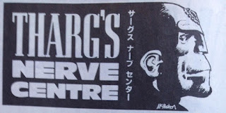
wasn’t absent from the Prog! His rendering of Tharg graced the Nerve Centre and
all sorts of other periphery for several years.***
He resurfaced with a
steady run of Progs from around 750-840 in a more refined style, using a
slightly different line weight (I think?) and generally making his figures even
more blocky and exaggerated. On Kano,
a Bad Company story that feels like a
spin-off solo series (although it is in theory a straight up continuation of
the story), his figures are incredibly gangly and quite zombie-like, which
really adds to the tone of that ghost story. Lovely stuff.
 |
| Thrax returns Word by Peter Milligan |
 |
| Kano meets the Frankenstein Corps - sickly experiments who protend death and pain. Words by Peter Milligan |
By contrast, his
work on Universal Soldier and Kelly’s Eye was incredibly kinetic.
 |
| Noirish thrills with Kelly's Eye words by Alan McKenzie |
You can sort of tell
that he didn’t have the strength at that time to go to town with the detail he
once poured into his work, but he had the skill to frame the action so that the
work felt at once child-like and artful, in a deliberately pop-kitsch way.****
Universal Solider saw
him teamed with vibrant colourist Zac Sandler, and this doubled down on the
popiness in a way that I really liked; shame we didn’t get any more of that. It
could have brought a missing zest to Bad Company 2000, perhaps.
 |
| That's what I call living technicolor Words by Alan McKenzie |
As we now know, a long
run of ill health forced Ewins away from the drawing board for too many years,
and eventually to an early death - but his legacy on 2000 AD will live forever.
May he rest in peace.
Personal favourites:
Rogue Trooper: Bagman Blues, Major Magnum, From Hell to Eternity
Judge Dredd: The Haunting of Sector House 9; Wally Squad; Hottie U; The Judge
Downstairs
Anderson, Psi Division: The Four Dark Judges; The Possessed
Bad Company: all of it
Universal Soldier: The Indestructible Man
Kano (which I’m singling out as its own thing)
Future Shocks: The Man who was too clever
For some reason,
Barney lists Ewins’ work on the Vertigo series Skreemer as part of his bio. I wouldn’t count it as part of his
2000 AD output, but it’s an excellent comic and a fantastic showcase for Ewins’
mid-period glory as an artist. Barney doesn’t list Johnny Nemo, which is much more 2000 ADish in tone, and also well
worth seeking out.
 |
| A burst of classic punk rage Words by Wagner & Grant |
More on Brett Ewins
Brett's own website is a great resource
There are plenty of heartfelt tributes and obituaries out there.
Forbidden Planet International has a whole host of links to celebrations of Brett's life here.
The Art of Brett Ewins, a book, is available to buy. Do it!
And here's an old TV clip where Ewins and Milligan talk Bad Company.
(why that series hasn't been amde into a film I'll never understand. It could be SO GOOD)
*I didn’t read
Deadline at the time, but it was advertised in 2000 AD, and reamins noteworthy for many thingsin particular influencing the direction of comics in the 1990s and beyond, and finding many new readers. From this Blog;s point of view, Deadline is especially noteworthy for providing a training ground
for future 2000 AD contributors including Jamie Hewlett, Philip Bond,
D’Israeli, Shaky 2000 and others.
**Bearing in mind that
10 year-old me had heard of all these dudes, knew they were philosophers, but
knew nothing of the actual content of their thoughts. Still pretty hazy on
that, actually, but there’s something about life generally being bleak, making
your own rules, and definitely not putting up with other people’s shit.
***In a twist of
irony, or perhaps a deliberate jibe, Ewins’s first Nerve Centre image was a direct
copy of an earlier version by Mike McMahon. Ewins had, some years before,
caused something of a stink when he was commissioned (by a fan, I guess?) to
redraw a Judge Dredd panel that was actually a McMahon original…
 |
| Design by Robin Smith? |
****I’m referring here
specifically to Pop Art in the Roy Lichtenstein mould, which raises questions
about art vs theft that I don’t want to go into here. What I mean to say is
that Ewins of this period had a way with comics that reminds me of the sort of
comic art that Lichenstein copied/adapted for his work, not least down to the
limited backgrounds and lurid colour scheme.


Here's the original Brett Ewins' take on 'Tharg's Nerve Centre'pose...
ReplyDeletehttp://heroesof2000ad.blogspot.com/2015/07/no-34-brett-ewins.html