Saturday, April 9, 2016

No. 65 Jesus Redondo


First Prog: 13
Latest Prog: 1858 (and given that his previous was Prog 1204, it’s not impossible he may return again one day)

Total appearances: 137
-including his work for Star Lord, but not for The Eagle, and not including Monster for Scream/Eagle. I hope you have your copy of the collection pre-ordered! (I'd never even heard of this series before, but a combination or Alan Moore, John Wagner and Jesus Redondo is not to be dismissed lightly)


Creator Credits:
Return to Armageddon
Mind Wars

Other art credits:
MACH One
Project Overkill
The Mind of Wolfie Smith
Timequake
Nemesis the Warlock
Rogue Trooper
Missionary Man
A lot of Future Shocks and one-offs, and, most recently, a 3riller
-and the second artist on the countdown who has never drawn Dredd.

Notable character creations:
Amtrak
The Lakam twins from Mind Wars would be notable if the series ever got a reprint (hint hint)


Redondo's work, especially on girls, is not a million miles from Ian Gibson.
Or is that the other way around?
Words by Alan Hebden

Notable characteristics:
I personally find Redondo’s style is recognisable from some miles off, but I’m struggling to condense it into words at this moment. He’s definitely fond of drawing creases in people’s clothing. His people tend to be beautiful, except when they’re hideously disfigured. He’s big on dramatic poses. It feels like he uses a lot of pen/brush strokes. Often eschews panel borders, without sacrificing clarity reading order (well, not usually), but making it bastard hard to sort out panel-specific scans.

Sure, the reading order is obvious enough, but it's odd without panels and borders. What does it mean, Scott McCloud?
Words by Jack Adrian
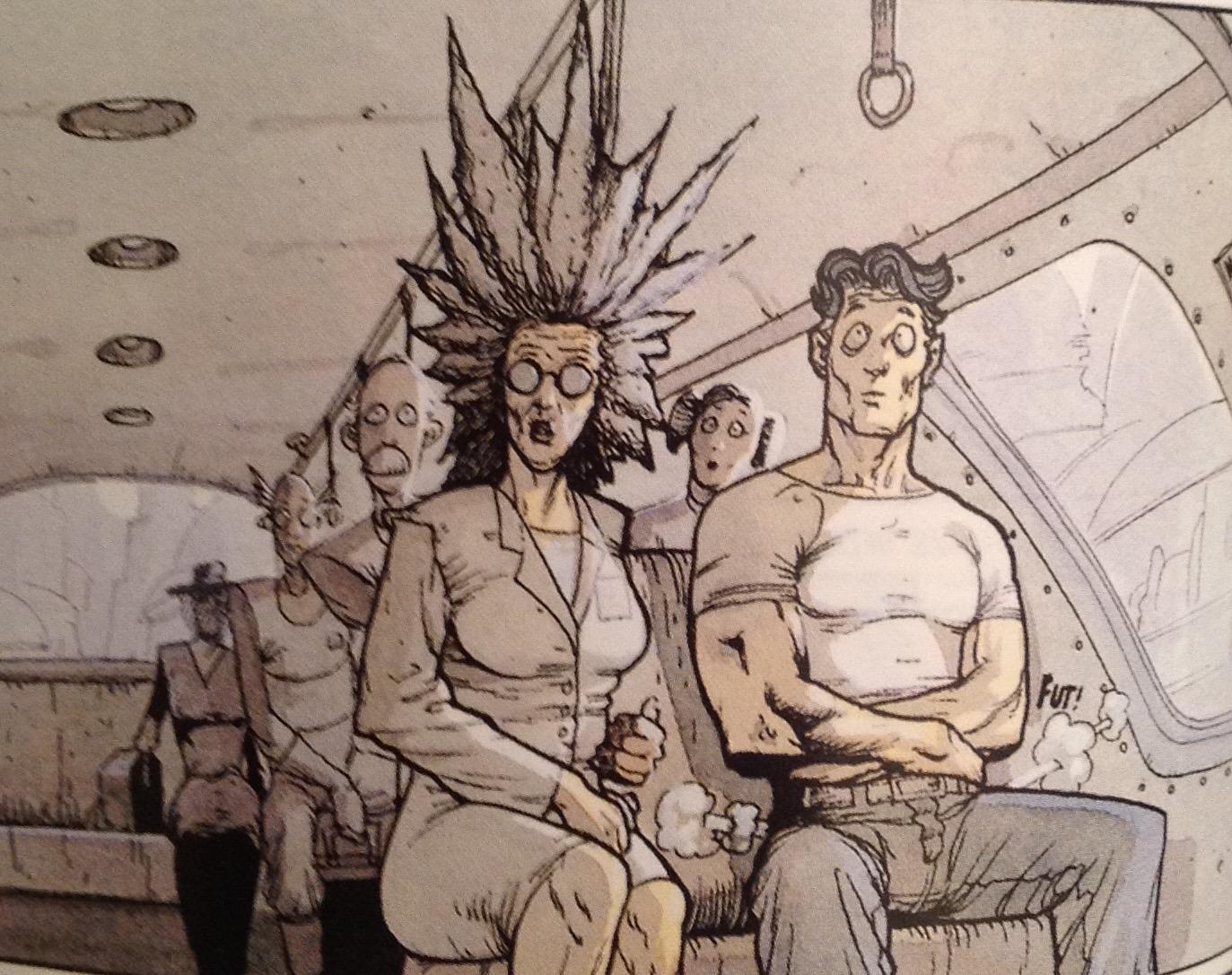
 He also likes to do this thing with a smudgy effect that probably has a techincal illustration name but I don;t know it. It's pretty cool, and can convey multiple ideas:

Smudges to show a psyhic breaking through to many minds at once.
Words by Alan Hebden


Smudges to show people trapped in a timeloop.
Words by Jack Adrian


Smudges to show horrifically thick swarms of flies.
Words by Pat Mills

On Jesus:
This isn’t relevant to anything, but seeing his name in the credits box was the first time I knew that people other than Mary’s boy child could be named Jesus. I have since learned it’s pretty common in Latin America (not quite as common as variants on Muhammad are in Muslim communities). Anyway, his art came with high expectations of living up to a big name! It has never let me down.

I suspect Redondo had been working in comics a fair while, as his style has been pretty set across his work for Tharg (and a certain Star Lord; no, not that one). Redondo's first entries into the Prog were on a decent handful of episodes of MACH 1. I wasn't born at the time it came out, but I fondly recall his version of John Probe from reading it as an impressionable 14-year-old*. Something about the way he drew flared trousers, and the general swingin' vibe of Probe as he coolly dispatches foes with generous helpings of violence. Or just stands around in his pants looking sexy.

Dig those flares, man!
Words by Nick Allen


Master of the flying kick
Context by Nick Allen


2000AD's pre-Slaine hunk of the month
Words by Pat Mills
It'd all be perfectly at home in a Bond movie. A Daniel Craig one, even.

Moving on, Redondo really came to prominence not on 2000AD, but on StarLord's opening strip, Mind Wars. Overally, StarLord's legacy will always be Strontium Dog and Ro-Busters**, but Mind Wars was equally good if you ask me. It was just a different beast – a standalone epic that came to an end within the pages of the comic, so couldn't have transferred to 2000AD even if anyone had wanted it to. It was certinaly streets ahead of two other self-contained 'epics' that ran concurrently in 2000AD: Colony Earth and Death Planet.

Look at those sad eyes. He's not aiming for camp.
Words by Alan Hebden
Redondo himself was a big part of that. Clearly a seasoned pro, he seemed to have it all worked out, from character design, to spaceship design, to alien worlds and space battles. In classic space opera fashion, physics be damned. There are sharp-banking spaceships, laser beams and explosive engines all over the shop. And somehow, it was all played straight and serious - but it really worked.


Then Redondo immediately proved he could do Earth-bound stories to, being tapped to take over from Ian Gibson on Project Overkill, and then from Gibson again (via series creator Vanyo) on the second big Wolfie Smith serial to run in 2000AD. Overkill provided relatively contemporary action thrills a la M.A.C.H. One.


Wolfie Smith was a more varied assignment. I've said it before on this blog, but I do think a trick was missed not further exploring a character who is less and anti-hero, more an anti-villain. I mean, he has the charm and superpowers of a horrible person, but somehow gets caught up in the sort of scrapes that mean he ends up doing good, rather than evil. But Wolfie IS evil. I know because Jesus Redondo showed me.

Exhibit A: this is Wolfie daydreaming about what he wants out of life.
Context by Tom Tully

Exhibit B: Wolfie takes out some perfectly innocent security guards. Sure, he's being forced to do it, but look at the fiery delight in his eyes!
Words by Tom Tully
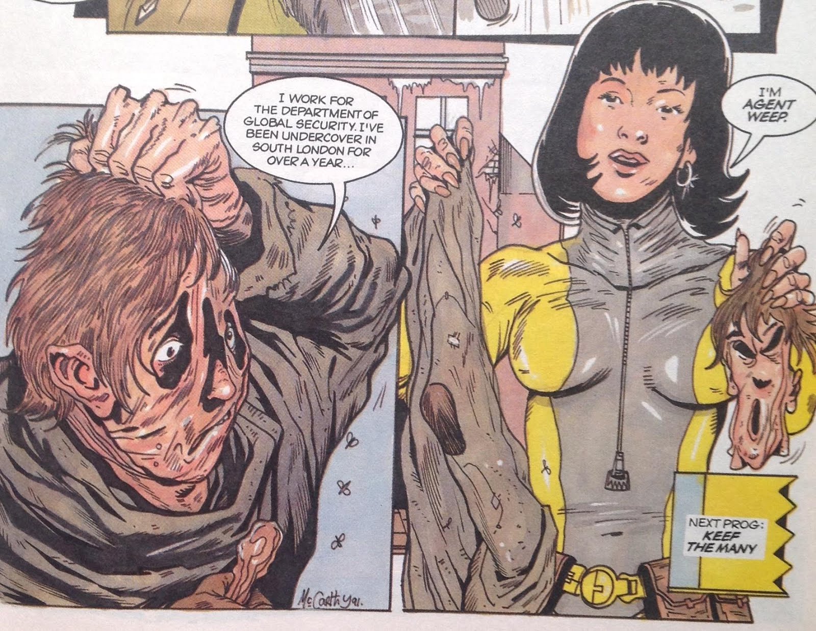
His time on Wolfie Smith also featured what would become a Redondo mainstay: a character with a hideously deformed face, mangled by fire and/or who knows what else. It's the best of 1980s gooey horror in comic-strip form. The dude would do an epic Freddy Krueger, I'm telling you.

I can't now if they ever explained why cheap villain Kramer had the face he did.
Words by Tom Tully
By this time, Redondo was a regular fixture in the Prog, burning brightly for the next few years. Following Wolfie Smith were two more extended runs, first on the epicly epic Return to Armageddon, which is just a ton of fun, and then on Nemesis the Warlock Book II, keeping the story going while series co-creator Kevin O'Neill slaved away on Book III.

But really, in my mind, this is the time when Redondo became king of the Future Shock, the Time Twister, and the one-off. His work one these tales, like contemporary Mike White, was never show-y off-y, but always suited the story. Such stories often don't afford the space to develop characters beyond a basic minimum, but Redondo can deliver the inquisitive professor, the bewildered bystander, the naughty boy who grows up to be Genghis Khan.

There's that cross-hatching effect Redondo brings out for the more serious, emotional panels.
Words by Alan Moore

More smudging, along with a scene-setting mist.
Words by Kelvin Gosnell

Debauchery as you like it: beer, beards and boobs.
Words by Steve Moore
 
Such great face work: the angry company man, the amused mother, the horrible brat.
Words by Chris Lowder


Relaxing into another panel showing a burn victim.
Words by Alan Moore
  And of course that's where the man has been seen most recently, delivering a Terror Tale and a full-colour 3riller, complete with dead men as protagonists. He's lost none of his charm, nor his love of drawing the folds in clothing.

Art by Jesus Redondo: Still instantly recognisable decades later
Words by Robert Murphy

Back to the epics, where characters really do have room to grow. Nemesis Book II is arguably not really Nemesis's story at all – it's about Brother Baruda, the faithful terminator who escapes from an alien PoW camp. He's all muscles and snarls and no compromises. Redondo also does well by Purity Brown, another mainstay of Book II. But his Nemesis himself, sadly, doesn't ever quite capture the gnarliness of the menace of O'Neill's version.

I always liked the way the logo for Book II matched the new art style.
And this cover shows a solid action-hero Nemesis, too.

Return to Armageddon is the real deal, of course, the 2000AD story for which Redondo will likely always be most remembered. It's been collected into a proper trade fairly recently, which is about the only evidence I have that plenty of other people (besides me) love this story. It's pretty weird, and by the end is guilty of a certain amount of cliché – but it's the sort of cliché that fits perfectly into the ethos of 2000AD, as a Sci-Fi adventure comic, so I'm not complaining.

Is he a demon, or a lovely little boy?
Context by Malcolm Shaw


Now that's what I call a hideous facial disfigurement.
Words by Malcolm Shaw

 But before it gets there, you get a changing cast of characters, including surly space pirates and a sort of benevolent robot who have all stepped right out of Star Wars. Who meet a hideously disfigured man in constant pain, who can't die – something entirely unlike Star Wars, but very 2000ADish. Then a bit of planet hopping, a girl, a demon, and, as promised in the title, some actual apocalyptic armageddon action!

Robot: check; Pretty girl in peril: check; literal cliffhanger: check.
Words by Malcolm Shaw


This is what the Armageddon will look like: people burning/drowning in a sea of fire, so far gone they don't even care when literal demons drop out of the sky.
Words by Malcolm Shaw

I wonder if today's readership would have the patience to indulge another such epic story, but if they did, I'd love to see Redondo have a crack at it.


More on Jesus Redondo:
His own website (ish)
A recent-ish career-spanning interview on Down the Tubes


Personal favourites:
MACH One (the episodes drawn by Redondo did were generally fab)
Mind Wars
Return to Armageddon
The Mind of Wolfie Smith (for the art specifically)
Shorts: The Time Machine; The Great Infinity Inc. Foul Up; The Pioneer; Sunburn

Redondo also provided a late outing for Missionary Man, wherein Preacher Cain helps a ragtag bunch of hideously deformed mutants.
Words by Gordon Rennie


*Somehow, I managed to amass an entire run of back progs at that time, and so began my first (and so far only) big re-read, a sacred duty to 2000AD fans that may as well count as a version of Hajj – something everyone should do, but only if they have the means to do it. I only had to read 900 Progs when I did it; I'm fairly daunted by the thought of tackling it again for a full 2,000 progs! Especially now that I know how much better a lot of later strips read in the collected editions.
**Strontium Dog was practically perfect form the very beginning; Ro-Busters, not so much. If it hadn't been for the early bits by Pat Mills and Kev O'Neill, I'm not convinced this was an obvious candidate for future greatness.

Thursday, March 31, 2016

No. 64 Jim McCarthy


First Prog: 37 (but as a mainstay, 500)
Latest Prog: 1961 (before the latest book of Bad Company, a Future Shock in Prog 1310)
 
Total appearances: 142

McCarthy's imagination and colour palette are equally vibrant.
Words by Grant Morrison


Creator Credits:
Bix Barton
The Grudge Father
Kid Cyborg

Other art credits:
Bad Company (series inker from beginning to end)
Rogue Trooper (inking again)
Zenith
The Geek, a one-off from Crisis that I have no memory of
A bunch of Future Shocks, including some of the very first)
…curiously, no Dredds.

Notable character creations:
Bix Barton
The Grudge Father
-is Kid Cyborg notable? Time, and perhaps one day a long overdue reprint with the Megazine, will tell…

Are you the future, Kid Cyborg, are you?
Words by Kek-W
 
Notable characteristics:
Generally anarchic. Sparkly – but also grungy. Absolutely not shy of gore. Has a way with raised eyebrows and body language generally. There’s something inherently earthy and fleshy about his work that I find v. appealing.


On Jim:
McCarthy got his start in the Prog inking over the top of his good pal Brett Ewins’s pencil art on two of the very earliest Future Shocks. For reasons unknown, Ewins made a go of it alone after that, until the launch of hot new series with Prog 500, Bad Company. McCarthy was on fire for that seies. And, in turn, he began to get work as an artist in his own right. Now, I’m not much of one for being able to recognise the work of different inkers, but I will say that McCarthy full artwork looks amazingly like one would expect based on his inking style.

McCarthy inking over Ewins. 2000AD was despatching zombies decades before they were cool.
Words by Peter Milligan


A helpful panel showing Rufus Dayglo's un-inked pencils next to the inked version.
That shadow on Danny Franks's jumper, that's classic J. McCarthy.
Words by Peter Milligan
Which is to say, thick, lush, vibrant, fun and a little bit loose.

McCarthy inking over himself. Everything feels so tangibly present, doesn't it?
Words by Peter Milligan

I’m not sure there’s much to say about Bad Company that hasn’t been said already. It’s excellent, it’s gorgeous. The ink work is no small part of that!

The changing face of Danny Franks.
Words by Peter Milligan


This cover is McCarthy’s own work (B.E. on the cover is presumably Brett Ewins, who may have inked?) – you can tell by the teeth! It’s entirely in keeping with the series style.

How do decayed zombie glands generate saliva anyway?
 
I suppose it’s inevitable when friends/family learn to draw together, but it can’t be denied that Jim does share some stylistic DNA with both Brett Ewins and baby brother Brendan.
Check out the faces and lapels in this early Bix Barton panel…

That attire is pure Brendan McCarthy, no? And the eyebrows + clothing creases are Ewins all over.
But the shiny bodywork on the car, and the delightful clouds - that's all Jim.
Words by Peter Milligan.
Around the time Jim and the Prog moved to more colour, his work took on much more of a life of its own. It becomes, for want of a better word, rounder. Or maybe that’s just the presence of women, a species almost entirely absent from Bad Company.

Rotting fleshbag turns into hot babe - does that count as body horror?
Words by that man again, Peter Milligan

A lot of the charm of Bix Barton is in the world around him – the flying car, the endless clouds, the general air of a Britain slightly off to the side, if not in the future. (Although the series is, I think, technically set a few years into the future).

And so to the Grudgefather, ‘based on an original grudge held by Jim McCarthy’. Wordplay aside, I assume what that means is that it was McCarthy’s idea to explore the ramifications of human cloning, how this would intersect with religious faith (apparently by completely superseding it, while retaining a largely Roman Catholic flavour). Also key is the idea that once human cloning was perfected, there’d be no more room for new beings to appear – our spirit essences will simply hop from body to body, with the genetic engineers sorting it all out for us.

McCarthy's art really came into its own with this series. And I do love the main character design, with the face mask that actually holds his constantly rotting clone-flesh together.
Words by Mark Millar
 
So it’s more fiction than science, but a neat premise. What may or may not be more of a Millar influence is the fact that the series ended up being amongst the goriest ever to see print. It’s total body horror, in the most Cronenbergian, pre-CGI oozy vein-bursting sense. Yum! Also: squish.

"She unzips her DNA like a favourite dress." How do you draw that??
Words by Kek-W this time.

As with Canon Fodder, scripter Kek-W took over for a more coherent, more intelligent but less lurid second series. Meg floppy, please, Tharg!*

Teaming with Kek-W then yielded McCarthy’s last hurrah (until Bad Company made its recent, triumphant return): Kid Cyborg. I dearly wanted to love this series, but it’s not quite all there. The design for Kid himself is pleasing. He’s part robot, part creepy but significantly heroic in demeanour. He’s teamed with a neat pair of companions. Vector 13’s Men in Black put in an extended cameo, essentially as villains, and McCarthy draws them particularly well, with all the menace of bureaucracy hidden behind there sunglasses and grey skin. There’s the plot itself, which is sort of about contemporary politics and mass media and all that. Frankly, it needed to be a 24-part epic to squeeze it all in, but that was never gonna happen in 1994.

Eaerly episodes had an old-school, Visible-Man type vibe.
Words by Kek-W

Aaah, the early 90s, when JFK conspiracies were all the rage.
Words by Kek-W

Which brings me to another point – what McCarthy was doing, during his central tenure under Tharg, was its own thing. You know, like most 2000AD artists have always done their own thing. And it was part of what gives the lie to the ‘lost its way in the early 90s’ tag of the comic. I’m not going to pretend that Bix Barton or the Grudgefather are/were among the all-time great series, but they’re both exactly the sort of thing that should be in a British Sci-Fi / dark humour comic.

Also, what a cover! Floating eyeballs never go out of style.

McCarthy, of course, went on to forge his own path as a comic strip rock biographer, presumably never looking back too hard at 2000AD. Good for him! And also, welcome back.

More on Jim McCarthy:
His own blog
An interview centred around his most famous work, the Kurt Cobain graphic biography**
The second half of a discussion panel with Alex Fitch***

Personal favourites:
Bad Company: all of it
Bix Barton: Barton’s Beasts; Lovesick World; Bloated Case of the Fatted Keef; Nigel, the Napoleon of East Finchley
The Grudge Father (especially Skin Games)

A deliciously gooey Nemesis star scan, during his socially conscious years around Book IX

*Not least because it’ll annoy all the people who are getting upset that Realm of the Damned is too gross for their tastes.
**In my experience, it's a constant presence on the shelves of any bookshop that deigns to have a Graphic Novel shelf (actually, Waterstones and Foyles are both pretty good for this, and they're about the only chains left) 
***Still not me, much as I envy his position as the next Paul Gravett (Fitch is to Steve LeMaq as Gravett is to John Peel: discuss)

Wednesday, March 23, 2016

No. 63 Greg Staples


First Prog: 761
Latest Prog: 1961

First Meg: 2.44 (cover) 2.47 (strip art)
Latest Meg: 330

Total appearances: 148

Staples has earned a serious rep as a creator of iconic Dredd artwork.

Art credits:
Judge Dredd
Slaine
The Clown
Mean Machine (technically a Dredd story, but it’s basically Mean Machine)
Sinister Dexter / Downlode Tales
Rogue Troopers*
Brigand Doom (in a Sci-Fi Special one time)
A couple of one-offs

Notable character creations:

Oola Bint
Jonni Kiss (although Peter Doherty did the cover - not sure which artist got there first)
The Whack Pack (although I can’t be sure if he was the first to draw each individual member. Where’s the dedicated SinDex wiki when you need it??)

Slick and stylish; costume design made to look easy.
Words by Dan Abnett

-and I believe he helped to create Witchworld, although he never actually drew any episodes, just this one cover. 

Staples does good sexy, also this is an unusually gratuitous example
(as opposed to his cover for the Prog 1066, the Sex issue, where it's thematically relevant)


Did he design the look of Caitlin, maybe? Is she a notable character?

Notable characteristics:
Master of a variety of styles, somehow combining paints that tend towards photo-realism alongside extreme cartooniness. Absurdly lush painting. Extremely beautiful people – but also absurdly grotesque people (not usually shown in the same style, mind you). Lavish textures. Drawing himself into his strips.

Staples (left) and Ennis (right) cameo as two doomed perps in a Dredd outing.
Words (and Pixies love) by Garth Ennis

Staples finds himself trapped on a bus full of perps.

On Greg:
When people complain that the early ‘90s in 2000AD was “full of Simon Bisley clones”, I suspect one of the specific names they mean is young Greg Staples. Heck, in his own Nerve Centre interview, he himself cites Bisley as the man who helped him get his foot in the door with Tharg.

90s hair! Staples started out young, didn't he.
But I’ve never really seen it myself. His early stuff was nothing like Bisley, except that, like all 2000AD, it revelled in the funny side of violence.

There's something delightful about the super chunky, super garish cartooning in this very early effort.
Words by Garth Ennis

I suppose you could argue that Staples's painted but also cartoonish work has a Bisley vibe to it, in that he was one of the first people to get famous for doing it. (And he did do it bloody well, too!)

Confident cartooning.
Words by John Wagner

I guess Staples’s first painted work on Slaine was a bit more similar, but only superficially. And you have to imagine than on that specific strip, he was probably editorially mandated to draw in a Bisley-esque fashion.

Making an effort to be lush
Words by Pat Mills

Of course, Staples back then wasn’t yet up to his best standards – he sure has come a long way since.

Making lush look effortless.
Words by Pat Mills
That’s one of the great joys of 2000AD fandom - getting to see new artists (and writers) figuring out their style on the page, and watching them get better. Frankly, by the time Staples took over on The Clown book II, in which he does an extraordinary job mimicking not Bisley, but Robert Bliss (series creator), he’d turned into his own thing.

Two contrasts in one: amazingly real painted art coupled with cartoonish goings on in panel 1;
straight up cartoony cartooning in panel 2. Nice lettering, too.
Words by Igor Goldkind
And the funny thing is, Staples doing his own thing turns out to mean Staples doing whatever he damn well pleases. The man has turned in a huge variety of art styles over the years, and you never know what to expect from story to story.

A moody flashback (with help from colours by Pete Doherty)
Words by John Wagner


Showing off his pencil and ink skills.
Words by John Wagner


Mixing up pencils and painting (and crazy cherubs)
Words by Steve White & Dan Abnett
His most recent work, Dark Justice, took him a notoriously long time to produce. The story goes that he wanted to put his all into it, cerate a truly stunning work of art. And it is quite something to behold! It also suggests that this hyper-real lush painting is what Staples himself sees as his ‘best’ work.

Judge Mortis is everyone's favourite sidekick, right?
Words by John Wagner
I’m not going to argue with that, but I do absolutely love his more comic-y, ligne claire-ish inking on some of his earlier strips, such as Rogue Trooper…

Such a lovely blue
…and Dredd efforts including Mad City, most famous for introducing Oola Bint, a serial killer who, I think, continues to evade Dredd.

Another fine example of European comics corgeousness coupled with Brit comic foolishness
And also Chris Evans cameoing as Fritz Shakespeare (that's him to the right, getting his head cut off). As the character is written, I can’t quite believe John Wagner specified the look – but it works overall, and singles Staples out as the assort of artist who puts that bit of extra thought and effort into his work to make it come alive.
Greg Staples is known and indeed adored internationally as a regular artist on Magic: The Gathering**. A card game based in s fantasy setting, where each card is adorned with more or less amazing artwork showing magical realms, beasts, warlocks and that sort of thing (not a million miles from the aforementioned Witchworld and Slaine, in fact).

As a master of iconic single-panel imagery, you’d think Greg Staples would be a legend at covers over on 2000AD and the Megazine. You’d be right! He's one of the top covers contributors, with at least 75 cover credits across various formats. A small selection...

This one is rather Bisleyish, I'll admit.

Equal opportunities sexy times

Love those veins

You know who has a back like that? Sylvester Stallone, circa The Specialist.

I miss Nikolai Dante's mecahnical flying chess knight

Staples would be amazing on ABC Warriors.

None more Dredd

It’s mostly through his covers that Staples has maintained a regular presence in the Prog since he got his first break. I guess within the pages he’s forged a place for himself as a Dredd artist, but he’s turned his hand to plenty of other strips, too, and it always seems to fit. I'd love him to him work on Strontium Dog one day. Obviously not going to happen, but he'd be a fun way to go if Carlos decides to quit.


With Greg Staples, you know you’re going to get something gorgeous, with fun poking in from all sides.

More on Greg Staples:
His own website
A dissection of his art on Dark Justice
Covers uncovered had him on for one of his all-time best ever covers
An old interview on House of Betty
An a super-old interview about his Magic the Gathering work

Personal favourites:
Judge Dredd: Rough guide to suicide; You are the Mean Machine; Mad City; Dark Justice
Slaine: Name of the Sword; Beyond
The Clown: his parts of Book II look amazing. I can’t in good conscience claim I enjoyed the story overly much. (Book I, on the other hand, that’s a classic)
Sinister Dexter: Drop Dead Gorgeous; The Whack Pack;
Rogue Troopers

The DC/Rebllion reprint years weren't great but this one cover suited the glossy look perfectly.
*The final series featuring Friday and Venus Bluegenes, wrongly credited to Alex Ronald over on Barney. An incredibly rare error from them!

**A game I found myself playing with a few colleagues at work for the first time about a year ago. It’s surprisingly fun, although I get the impression you have be something of an obsessive to have hope of getting good at it. And yes, the art is pretty fantastic, with Staples one of the better contributors.