Monday, July 25, 2016

No. 74 Frazer Irving


First Prog: 1205
Final Prog: 1621 (cover) 1566 (strip art)

First Meg: 4.05 (aka 187)
Final Meg: 257

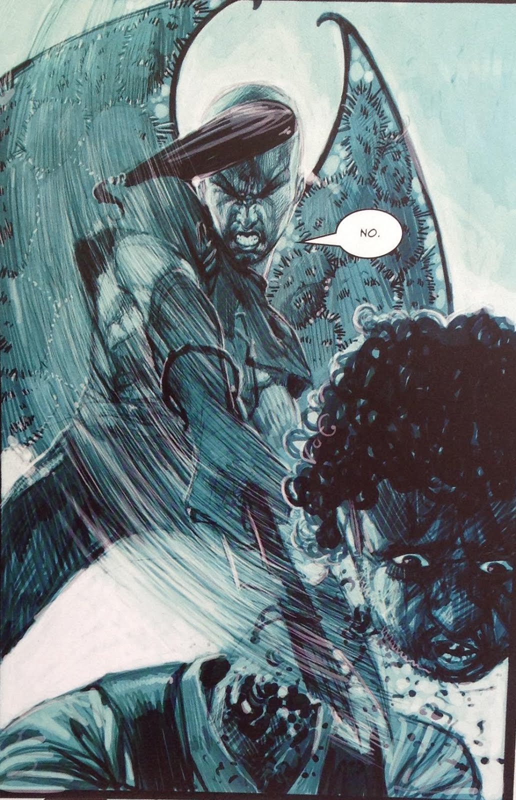
The spiked club hitting the youthon the head is a metaphor for
the power of Irving's art.
Words by Gordon Rennie

Total appearances: 119
-including a handful of short Terror Tales originally published in Metal Hammer, but available to read on Barney.

Creator Credits:
Necronauts
Storming Heaven
A Love Like Blood
The Simping Detective
From Grace

Other art credits:
Judge Dredd
Judge Death
Sinister Dexter
Sean of the Dead
Durham Red
Button Man
Future Shocks and a couple of especially memorable Terror Tales

An early effort on Sinister Dexter reveals an inherent penchant for
expressive emotions and an overriding subtext of fear.
Words by Dan Abnett


Notable character creations:
Jack Point
Miss Anne Thropé (you gotta say it to see it)

How to use dead space.
Words by Si Spurrier
 
Notable characteristics:
The man uses lots of ink, carefully. Sure, that’s a facile definition of a lot of artists, but somehow Irving really forces you to see the decisions he’s made about where to put his ink on the page. Lines everywhere, often not straight. Large patches of dark, mixed with large patches of white. Prioritising mood and emotion over realism. Backgrounds made of textures rather than objects. Bringing fear, sadness and pain to life.
Somehow managing to lace the same sort of imagery with comedy when the script demands it, but not when it doesn’t.

Has Anderson ever looked so sad?
Words by John Wagner

Irving's nmae is on that long list of artists who will draw Judge Dredd's helemt just how he likes it, and not like anyone else goddamit.
Words by John Wagner


Another visual metaphor for you.
Words by Gordon Rennie

On Frazer:
Frazer Irving burned brightly but all too briefly in the Prog and Meg. He appeared, seemingly out of nowhere, with a super-distinct style that really shook up readers (well me, anyway), reminding us that 2000AD continues to be THE comic to go to for exciting new creators. His style caught on so quick he was as regular a feature as any artist for about four years, first in the Prog, then moving over to the Meg.

It's a rare future shock that merits a cover spot


Irving in the making - you can see his signature style just waiting to burst out.
Lines yes, cross hatching, no.
Words by John Wagner

Very evidently suited to horror, he graduated pretty quickly from Future Shocks and a single Dredd tale onto horror-themed romp Necronauts. Which isn’t actually a horror story in itself, although it has plenty of horror trappings that Irving ably brings out.

Conveying horror and paranioa through wavy lines.
Who needs background detail when you can use abstraction to create tone?
Words by Gordon Rennie

A Love Like Blood, similarly, uses classic tropes from the world of horror (werewolves, vampires and forbidden love), but dresses them up as an action story. 

...and howling werewolves.
Words by John Smith
Angry vampires...

It’s perhaps telling that this full colour strip didn’t hit quite as hard as the black-and-white Necronauts had done. Sure, you need colour to really drive home the red red gore, but overall it lacked the same atmosphere. Or maybe I just have a fondness for cricket bats as weapons.

Violence through motion. Thin lines and white spaces again.
Words by Gordon Rennie.
 (see also Irving’s work on that one Shaun of the Dead prequel)


Thick, overbearing black-and-white atmosphere hit in abundance with Judge Death. My Name is Death, in particular, is generally regarded as the first time the character has been played more for horror than laughs since his very first appearance.*

Wavy lines again. Thicker this time, for more horror.
Words by John Wagner


The Judge Death heart squeeze - never not terrifying.
Words by John Wagner.
Wilderness Days was back to straight up comedy, really, although Irving’s art means that one is often reminded just how horrifying the character can be.

Death comes on a quad bike.
 That trademark creepy atmosphere also hit home in two much-hyped Terror Tales, Reefer Madness and Mars Needs Mates. Both were in colour, but, crucially, limited palettes (one overriding colour with occasional splashes of another) that proved to be exactly right for evoking dread, comedy and a massive dose of irreverence for the source material (both were derived from 1950s B movies that are remembered more for their ludicrousness than for being any good).

The sickly yellow fo the addict gives way to the raging pink of the infected.
Words by Gordon Rennie.
Also, drugs are bad.
Genre-wise, you could say that Irving had a go at a bit of everything in his time with Tharg. It’s comedy more often than not – as shown above and never far from any 2000 AD strip, really - but when it’s not at all funny you get the sombre tone and downright nastiness of Button Man IV, ultra-serious character horror with From Grace, or indeed the way-out weirdness of Storming Heaven.

Storming Heaven, which actually hit the Prog before Irving’s first Judge Death series, showed off the man’s experimental side. It was as if he’d seen the colours on Love Like Blood come across decidedly average, and resolved to try using colours for a different purpose. Once again, it’s about atmosphere. 

How does he get that white to be so very white?
Words by Gordon Rennie
Storming Heaven is deliriously shiny and vibrant. It’s sort of limited-palette plus, with mostly one set of hues, but then bursts of gold and yellow and all sorts. The whites, especially, stick out. 

Conveying heinous evil through photoshop effects.
Words by Gordon Rennie


As with a lot of Irving’s work, there super-expressive emotion on show everywhere. Often this is in the form of either extreme sadism or extreme terror/despair. A mood that works better on some stories than others, if I’m honest. Yes to straight up fun like Necronauts or straight up horror like From Grace, not so much to things that get caught in between. But always unique, and it’s a style I am massively partial too. And it’s good to be experimental.

Angry mob; driving rain.
Words by Si Spurrier.


Look at those two faces: pure hatred meets final terror.
Word by Si Spurrier

I would argue that Irving’s final series for Tharg, Button Man IV, saw the artist perhaps reining himself in a bit, no doubt out of respect for series creator Arthur Ranson. Their style couldn’t be more different, but Irving’s work is a bit straighter, moodier rather than outright gaudy with atmosphere, and painted colours that are a little more real. There’s still plenty of trademark sadism and terror, as you would expect from Button Man.

Irving's Ransom: Realism that isn't real.
 
So far, I’ve not mentioned the man’s signature series, the one that will likely be remembered and revived the longest – The Simping Detective. And certainly it his I think his most accomplished work, hitting a fantastic mix of comedy, weirdness, atmosphere, character and experimentation. Although if I’m honest I’m more likely to turn to his really early work to get that fondly-remembered hit of ‘gosh, this is bloody good isn’t it’.

Full colour; still noir

It’s also when his work actively got more three-dimensional. Something about his inking/painting that fleshes out his characters more. Technically this series began as a one-off story for ‘Mega City Noir’, so of course it’s all wrapped up in 1940s/50s Hollywood detective style. Which is to say, lots of black and white, lots of venetian blinds, femmes fatales and the feeling that everything is soaked in bourbon (not least our hero).

Not many artists could get away with that costume design
Words by Si Spurrier

It’s a right treat, although I would say that Spurrier’s authorial voice comes on so strong that of all Irving’s work it’s the one I least notice his hand in, even though his style is as potent as ever. Of course, in comics part of the trick is not to be noticed, and just to let the story play out in front of the reader’s eyes.

I imagine in the years since he’s moved on, Irving’s style has developed in ten different directions – I’d love to see him in the Prog again showing us what he’s learned.


More on Frazer Irving:
His own Tumblr
A super-old interviewwith no less than Al Ewing
Covers uncovered, of course

Personal favourites:
Judge Death: My Name is Death, Wilderness Days
Necronauts
Reefer Madness
The Simping Detective: all of it
From Grace
Button Man IV


Always end with one last scare...
Words by John Smith

*You could argue that Bolland’s relatively serious art keeps ‘Judge Death Lives’ in horror territory; Necropolis too isn’t exactly funny, but it’s much more of an action story than it is a horror one, especially the Death/Fear/Fire/Mortis bits.

Saturday, July 16, 2016

No. 73 John Ridgway


First Prog: 377
Final Prog: 997

First Meg: 2.10 (aka issue 30)
Final Meg: 245

Total appearances: 119

Creator Credits:
The Journal of Luke Kirby
Junker
Calhab Justice
Darkness Visible
The Dead Man
Vector 13 – he was the first artist on it, anyway

Other art credits:
Judge Dredd
Missionary Man
Young Middenface
Strontium Dogs
Armitage
Various one-offs

Notable character creations:
Luke Kirby
Yassa Povey
Judges Nausea and Phobia
Judge Ed MacBrayne
The Men in Black (well, he was the first to draw them in a published story; not sure if he was working off another artist’s design)

The hat, the glasses, the cheekbones, and of course the setting in an entomologists gallery.
Vector 13 is creepy stuff.
Words by Shaky Kane

Notable characteristics:
I don’t suppose people debate the topic much, even on the dustiest corners of the internet, but it seems to me that Ridgway has the accolade of being the best artist at drawing both young children and very elderly folk. You could argue about if he’s also the best at drawing grizzled, manly men, but his name belongs in that conversation, too.

What it is, is work is full of lines. Wrinkles, stubble and individual hairs most obviously, but also just a generally sketch-like quality to all his work.

There’s also a facility with horror, atmosphere, and grounding things in nature. He surely has drawn more trees and rustling leaves than any other 2000AD art droid.

Also, eyes. I don’t know that any other artist has come close to drawing out as fearful and, at times, viscerally disgusted a reaction as Ridgway has managed, time and again.*

This is a dude who really takes delight in carving out a person's heart.
Words by Gordon Rennie


On John:
I don’t know Ridgway’s work outside of 2000AD, but I’ve an idea he was something of an old hand in the UK comics scene before he was tapped by Tharg, along with the likes of Arthur Ranson and John Burns. He always had that feel of a seasoned pro who just knew what he was doing, and knew who he was doing it for – namely, young boys who wanted cracking adventure stories that didn’t talk down to them.

In fact, on that point, Ridgway himself said in a Megazine interview that he specifically preferred to draw stories aimed at this audience, and didn’t care for the adultification (or whatever the word is) that was en vogue in UK comics of the late 80s onwards. Its apposite, then, that Ridgway’s work for Tharg during that period was consistently excellent.

The children/old people thing came up almost from the beginning with Ridgway, notably on one-off spooky tale Candy and the Catchman, which is sort of about the fear of ageing (as only a lifelong aesthete like Grant Morrison could feel that fear).


Moving onto Judge Dredd, Ridgway was, I think, one of the first to really get behind the notion that Dredd himself was entering late middle age. No less healthy or athletic in build, but certainly more wrinkly of chin.

A repellant gentleman
Worsd by Wagner & Grant
Under Ridgway’s pen, Dredd’s foes aged up a bit, too. The Raggedy Man is of indeterminate age, but his demeanour gives the same vibes as that of a retiree. And, yes, a touch of horror. Miss Marple, over in Alzheimer’s Block, is a true retiree. This provides a perfect example of marrying the right artist to the story. It’s a straight forward mystery with seriously spooky overtones, but a rich vein of comedy all the way through.


The grateful dead
Words by John Wagner
At the same time, Ridgway was marking quite a mark with a story that seemed to come somewhat out of nowhere: Summer Magic. Once again, it combines a convincingly rendered child – young Luke Kirby – with convincingly rendered grown-ups (his mum) and slightly creepy older people (his mysterious uncle). Also, werewolves, trees, night terrors and just a superb combination of adventure and horror.

Luke Kirby: a bored child looking for adventure.
Words by Alan McKenzie

Luke Kirby has found adventure - but can he handle it?
Words by Alan McKenzie
Luke Kirby’s further adventures retained a certain charm, and an endless grounding in the natural world, but I’m not sure he ever topped this first foray. 

Getting up to wizardish wheezes with pals in the woods
The Dead Man. The Deam Man! How bloodty great was that series - and how amazing that it holds up so well on re-reads, even when, at the time, it was all about the mystery of 'who is the Dead Man?'.

A rare John Ridgway cover
Another boy hero for the ages, Yassa Povey. Two amazingly horrible villains in Nausea and Phobia. Yet more bug-eyed terror. And a hideously scarred eldster in the title role. It's a masterclass in storytelling, and also straddles the line between adventure and horror.

Yassa Povey meets the Dead Man. A scary start, but only about the fourth most scary thing
that's going to happen to the poor bastard...
Words by John Wagner

Ridgway’s next co-creation was far less well feted. Yes, it’s Junker, occasional contender for worst ever series. But not for the art. Ridgway constructs a generic 2000AD-lite grizzled antihero, and teams him up with a sort of rat-lizard (actually quite fun), and a scheming alien princess. It’s all a bit Star Wars (or possibly a bit Firefly, if that show had existed a decade earlier).

Junker doesn't trust women. Raz is more intersted in food.
Words by Michael Fleisher
Notoriously, Ridgway had to cope with scripts that demanded impossibilities such as the hero shooting from the open window of a spaceship in space (or something like that). He makes a game effort of it all. More on the story itself in the upcoming entry for writer Michael Fleisher, but in tone, there’s nothing really wrong with Junker, certainly as drawn by Ridgway. Certainly I was into it for the first half, at the time. This story, and Ridgway generally, felt like they were my 2000AD (as a then 12/13-year old). Much more accessible than snide-y / arty stuff like Time Flies or Hewligan’s Haircut that Tharg seemed to like so much in the Nerve Centre.

Junker's still not too sure about women; Ridgway is possibly starting to care a little less at this point, too.
Words by Michael Fleisher
With a pro like Ridgway, you’re going to get solid storytelling, well realised scenery, a range of emotions from the characters, and bursts of tension.

See also Calhab Justice, which Ridgway spearheaded over in the Megazine. Lots of promise, especially in the art, slightly let down by a script that, to my mind, needed stronger editorial guidance. Or maybe I was the problem, not really having any context for concepts around whiskey clans and stolen scone stones, being as I am a dirty Euro-Souther**.

Once again, Ridgway delivers on the natural world, setting scenes in the highlands. But what shows up more in this series are his people. There’s a lot of shouting, emoting and indeed laughing. An early Christmas (well, I guess technically New Year’s) episode was particularly effective at setting the overall tone, which balanced out the sense of Cal-Hab as a neglected, impoverished place with the inherent warmth and comedy of the characters.
 
Mutant rats on the mean streets of CalHab
Words by Jim Alexander


Elegantly expressed comedy from CalHab's newest recruit
Words by Jim Alexander

It all went a bit loopy after Ridgway left, which may or may not have been a factor in why he stopped working on the series.

Back in 2000AD, Ridgway was once again called upon to develop new characters and ideas. He drew the first episode of Vector 13, and may or may not have designed the look of the Men in Black, series hosts and occasional bit-players in other stories of the era. Although I suspect Shaky Kane, who wrote the opening epsiode and was clearly a big fan of Forteana, probably had a hand in it, too. Lest you forget, Vector 13 was a new way of doing Future Shocks with a narrator, with stories tending to follow the sorts of things one might find in TV’s the X-Files. Overall, Vector 13 has, I think the highest hit-rate of good-bad stories of any 2000AD series in this format*** 

Severed head no. 1
Words by Shaky Kane

Severed head No. 2
Darkness Visible arguably functioned as a more fleshed-out version of Vector 13. It followed private investigator Alec Holland, who could have gone on to pursue all sorts of UK-based goings-on, but as it is we only got to read the first half of a mystery about a cult. Ridgway is the man to do this sort of gentle, dread-based spookiness (ably helped by colourist Gina Hart, who seemed, in the end, a better fit for Ridgway than Tim Perkins, who he previously been paired with on Junker and various Dredds).


Yup, you'll need a gun if you're going to Wales.
Words by Nick Abadzis

That seemed to be it for quite a while – until we were gifted with a burst of activity in the new-look Megazine of the Alan Barnes era. After a sustained dodgy period, artwise, (rather a lot of Volumes 2 and 3) the Megazine looked to old hands such as Ridgway to bring it back on course. And so we got to see the man’s take on Missionary Man, Armitage and Young Middenface McNulty.
Grizzly Man No. 1

Grizzly Man No. 2

More charming boyhood aventures with young McNulty
Words by Alan Grant

Sometimes, a cry and a cuddle is what you need. We don;t see nearly enough of this sort fo thing in comics, I reckon.
Words by Alan Grant

Once again, it’s the scenery that sticks out in my mind, along with the emotional core of the characters.

If there’s one thing I haven’t explored so far it’s the fact that Ridgway’s style is really not like anyone else (Vince Locke, maybe?). It’s not at all flashy. At times, even, it can look a little childish – I can certainly imagine the Bisley-o-philes of 1989 wondering why someone who art was, for want of a better word, uncool, was getting so much work in the Prog. I’ve been guilty of thinking those thoughts, too – but every time I’ve read a Ridgway story, I’m always struck by how visceral it really is. 

 
The leering stare and the reaching hand - simple drawing, super effective character-filled stroytelling.
Words by Jim Alexander
Yes, sometimes, the poses are a little stiff, and sometimes the wrinkliness of the skin seems too much – but damned if it doesn’t sell what each character is thinking and feeling. And damned if it doesn’t push that envelope to extremes that few other artists reach. H’mm, Defoe needs a new artist – I wonder if it might find a happy home with an old master..?


More on John Ridgway:
Tharg’s still showing the love on a dedicated Tumblr

which also links to a big, notable candid Comics Journal interview 

And David Bishop shared his interview with the man for Thrill-Power Overload:

A vision of hell on earth. It's the greedy boy with the burger that gets to me most.
Words by Alan McKenzie


Personal favourites:
Judge Dredd: The Raggedy Man; Twister; Alzheimer’s Block; Damned Ranger
Luke Kirby: Summer Magic; Trick or Treat; The Dark Path
The Dead Man
Calhab Justice: Hogmanay
Darkness Visible
Candy and the Catchman


* I’ve written about this at length before, here’s a handy link****:

**Half German, Half English, essentially lived all my life in London in case this helps put my opinions in a useful context.

***Tales from the Black Museum in the Meg has been pretty amazing, too, although it’s had far fewer entries to compare.

****And why not stay to enjoy some incoherent ramblings about all things 2000AD, written a surprisingly long time ago…