First Prog: 594 (or maybe the 1988 Winter Special – not sure which came first)
Final Prog: 1603
(It’d be great if he came back, but he’s pretty busy over in the US)
First Meg: 2.27
(aka issue 47)
Final Meg: 290
Total appearances: 213
Creator credits:
The Balls Brothers, Badlands, The Inspectre, Mercy Heights/Tor Cyan
Other art credits:
Strontium Dog
Rogue Trooper
Harlem Heroes
ABC Warriors
Anderson, Psi Division
Judge Dredd
A bunch of Future Shocks
-not to mention, he was a key
concept artist on The Judge Dredd movie. Yes, that one.
 |
| Robots with lady parts: 2000 AD in the 90s. Words by Pat Mills |
Notable character creations:
Morrigun (for a time,
the seventh ABC Warrior)
Rocky and Egbert Balls
The Inspectre
The cast of Mercy Heights
-but especially Tor
Cyan
The Mandroid
Notable characteristics:
 |
| So evil he can't quite smile. Words by David Bishop |
He’s undergone a
couple of pretty seismic style changes, so it’s hard to point to anything
consistent beyond ‘bloody good’. I guess his characters tend to be on the
stocky side, rather than being svelte. Certainly no stranger to comedy (most
overtly in the Balls Brothers), but I find Walker’s basic tone to be quite moody and
grim. Grimaces are not far from his characters faces.
On Kevin:
As mentioned above,
2000 AD readers have had the privilege of seeing Kevin Walker develop as an artist,
watching him try out and hone new techniques. Outside of a Strontium Dog and a Ratty
(yes, Fink Angel’s pet rat had its own story once*) story from two old
specials, his first work was as an inker on the top of Steve Dillon’s pencils.
 |
| Walker stage 1 Words by Alan Grant |
 |
| Walker stage 1: not afraid of aclassic pin-up shot Words by Alan Grant |
Presumably Dillon was
partly there as a master of storytelling and basic panel layout / character
positioning, while Walker could concentrate on honing his detail skills. As
luck would have it, their first joint assignment was the rather astonishing Rogue Trooper story Cinnabar, the first of a handful of attempts to just go ahead and
tell fun stories about Rogue and his biochip buddies without worrying about
continuity.
 |
| Dillon without Walker |
 |
| Dillon with Walker. Darker; more intense Words by John Smith |
As luck would then
have it, the two were re-teamed for a shockingly long run of a revamp of Harlem Heroes. There’ll be more to say
about this another time, but as editor Matt Smith recently wrote in a Megazine
letters page, the art is well worth a
second look. They may not be fondly remembered as characters, but by God they
had requisite distinct looks and personalities, much down to Dillon and Walker.
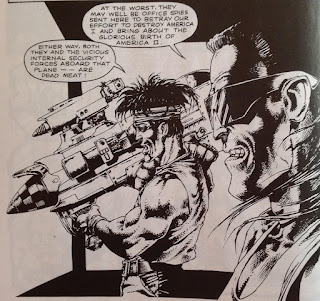
Ana, after a somewhat serious start, the artists began to embrace a certain
ridiculousness, it seems. Check out the size of that gun!
 |
| A hint of Dillon, a ton of Walker Words by Michael Fleisher |
After a long
apprenticeship as an inker, Walker
promptly reinvented himself as a painter. Witness a gorgeously metallic run on ABC Warriors, and a Total Recall-esque Judge Anderson adventure on Mars. Both
series indulged a very 2000 AD mix of deadly serious and even quite grim goings
on with lashings of comedy.
 |
| Walker stage 2: That's what I call Mek-nificent |
 |
| A perfectly posed comic moment Words by Pat Mills |
 | |
| Anderson does Barbarella Words by Alan Grant |
 |
| Childhood's End: nothing like Total Recall as a story, but the tone of the art was very reminiscent. Love that film. Words by Alan Grant |
The underlying pencil
work on these two series had a brief outing on one-off Antarctic Judge series Wynter,
 |
| Mercs in the snow Words by Robbie Morrison |
before lending itself to full on
world building and character design triumphs on Mercy Heights.
It’s the same basic style as on Anderson:
Childhood’s End but more refined, I think. Or, in other words, better. It’s
not the most fondly remembered series, and for some good reasons, but the basic
characters design from Tomlinson and especially Walker were perfect.
 |
| Walker stage 3.5: You can see the style developing, right? |
And then it was time
for another reinvention. First, as a writer.** Walker hit upon the idea of a psychic
tortured by the aftermath of the Apocalypse War. He designed a sinister look to
match a classic pun with the Inspectre.
Not much comedy in this series, with darkness and tension the order of the day
- and actually rather well done. Able plotting and script assists from Jim
Campbell (not to be confused with Jim Campbell), who later took over the series
as writer with Walker’s
blessing…
 |
| Walker in atmospheric mode Words by Walker and Campbell |
 |
| The Inspectre's signature look Art by Charlie Gillespie; Words by Walker & Campbell |
…who was back to the
drawing table with his most radical shift yet. He emerged as a more traditional
and hyper-detailed pen and ink artist on out and out comedy series the Balls Brothers. main change to my
eyes was just how bright and cheerful it looked, although that may have had as
much to do with poor printing processes hiding his paintwork in the early 90s.
 | |
| Walker stage 4. Very different. Look at all that rubble! And so bright! Words by John Wagner |
 |
| Breaking panel to match breaking temper. Simple but effective. Words by John Wagner |
You can still see Walker’s chunky face
design at work, but the overall feel is so different! Also it’s incredibly
vibrant and just a delight to look at. Apparently, it took him ages to do, and
then of course the readers didn’t like the series anyway (frankly it was just a
bit too silly).
He returned to paints
for a very short run of creator-owned series Badlands, something of a
curio among 2000 AD stories but if you like luscious art and the mixture of
western gunslingers trapped in the Lost World, well worth a look. In some ways
it’s a little like a series of stunning paintings that happen to fit together
as comics panels.
 |
| Dinosaurs belong in more comics Words by John Wagner |
Time for Walker to change up again,
using a similar style to Balls Brothers
but a very different tone and texture. It’s this style that earned him perhaps
the highest praise yet (maybe after his initial work on ABC Warriors), creating a stark and gritty Tor Cyan…
 |
| Walker stage 6: Like Balls Brothers, but with more black. Words by John Tomlinson |
…before working on a
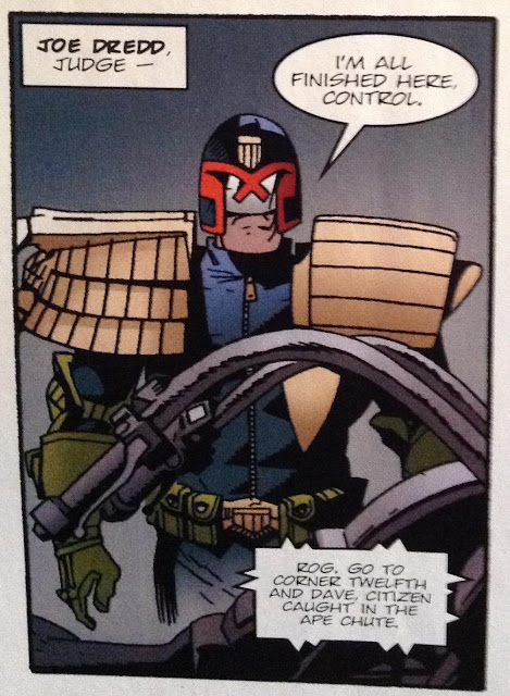
steady stream of key Judge Dredd
micro-epics, from Sin City (aka Satan’s Island) to the much-beloved Mandroid, and the superb prologue to Origins. In fact, for an artist who is,
in my head anyway, something of a go-to for important Dredd stories, he
actually hasn’t drawn all that many.
 |
| Walker's second Orlok story. Recognisably the same character, but such a different drawing technique. Words by John Wagner |
 |
| Walker's most recent 2000AD style. Look at all those panels! Storytelling par excellence. Words by John Wagner |
By the time he’d cemented a solid working
partnership with writer John Wagner, he was busy getting steady work over the
pond. Our loss, their gain, but at least his art is still on regular public
display!
 |
| Kevin Walker: yet another definitive Dredd artist |
Personal favourites:
Rogue Trooper: Cinnabar
ABC Warriors: Khronikles of Khaos; Roadkill
Anderson, Psi Division: Childhood’s End
The Inspectre: Requiem
Mercy Heights: Book 1
Judge Dredd: Mandroid; The Connection; Mutie Block
 |
| What's black, white and red and can't turn round in corridors? A nun with a javelin through her head. (OK, so it's not a nun, but the best visualisation I'm likely to encounter of a joke I love) |
More on Kevin Walker
A cracking interview
on the Thrill Cast, especially informative on his work for the Judge Dredd film
(1995 variety)
Abaddon author
Jonathan Green has some lovely art and general art conversation with him on his
blog.
*Actually, the hero of
the story is Ratty’s son, not Ratty
himself.
**Chronologists will
note that the Inspectre appeared some
months before Mercy Heights,
but that truth doesn’t fit the narrative I’ve sloppily constructed. And it may
be the case that he created Mercy Heights
first, it just went to print later?

No comments:
Post a Comment