First Prog: 1035
Latest Prog: 1823 (no
more Dante, but anything Tharg can do to get Fraser drawing again would be
great, please. Seriously, his Dredd work is amazing.)
First Meg: 2.72
(aka issue 92)
Latest Meg: 305 (but
I’m holding out for Book II of Lilly MacKenzie to appear here in print…)
Total appearances: 203
-including his creator-owned
series Lilly MacKenzie, which premiered on his website but was reprinted in the
Megazine.
Creator credits:
The Adventures of Nikolai
Dante; Family; Lilly MacKenzie
Other art credits:
Judge Dredd
Shimura
A single Past Imperfect
Notable character creations:
Nikolai Dante – and
almost everyone and everything associated with that series
I’m not sure, but in
‘Blood Cadets’ he may have drawn some of the first versions of a selection of
Dredd clones who have grown in prominence over time. Making him, in a way, one
of a handful of artists to draw ‘Dredd’ without his helmet on…
Notable characteristics:
Constant, dynamic,
swirling motion. A full range of human acting ability. Showing the action from
bizarre angles. Fleshy characters. A flair for body horror – although this may
be pure coincidence of the stories he’s worked on. Anyway, he’s dead good at
drawing people morphing from one shape into another, often with gruesome
consequences. He seems interested, too, in trying to get to a certain reality
in the way things work, and the way real people look.
 |
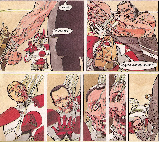
| Crazy swirly fighting effect! That's how to make an entrance to upstage Nikolai Dante. Words by Robbie Morrison |
On Simon:
As a 2000 AD artist,
Simon Fraser is so strongly associated with Nikolai
Dante that it’s hard to look beyond that. But, you know, his Judge Dredd work is pretty darned
fantastic; his Shimura episodes some
of the best that character had, and he did get to co-create Tharg’s only
full-on gangster series, Family.
 |
| Straight lines everywhere. Who needs cross hatching? |
Nonetheless, The Adventures of Nikolai Dante was the
first story he worked on for Tharg, and it kept him pretty busy for the next 12
years or so, (with the odd break), and it remains a much-beloved classic
series. Indeed, while I do remember some readers complaining that they lost the
thread of the story somewhere around the Pirate Queen arc(s), I don’t recall
anyone ever having a bad thing to say about the art, especially not Simon
Fraser’s art.
The prehistory of the
series suggests that writer Robbie Morrison had intended it to be a period
piece, set somewhere between 1700 and 1900 I’d guess. Then-Tharg David Bishop
told him to Sci-Fi it up so it’d fit better into 2000 AD. Where, when and how
Fraser got involved I don’t know, but I do know that he brought some serious
sci-fi skills to the mix.
Firstly, there’s those
fantastic flying chess knights, as seen on this cover from the original
hardback reprint of the first series.
 |
| Why shouldn't flying cars look like chess pieces? |
Thirdly, there’s the
race of pink lion/marshmallow hybrid aliens, who show up quite a bit early on,
and then basically disappear once it’s apparent John Burns couldn’t quite
render them so well, and Morrison probably never liked them that much anyway.
Fraser made them pretty convincing, I thought!
Fourthly, and perhaps
bestly, there’s the architecture. There may be readers who never took to
Fraser’s style, but I can’t believe any reader felt anything less than
jaw-dropping admiration for the man who poured his time and ink into designing
and drawing magnificent cities, floating palaces, flying fortresses and the
like in all their art nouveau/art deco / art who-the-f-knows window-laden
masterpieces. If there was one thing that really sold the ‘old world in the
future’ setting it was the location dressing.
 |
| When I become Tsar, I'm having one of those built for me. Words by Robbie Morrison |
Of course, if there’s
one thing that really sold the actual story, it was Fraser’s character design
and facility with expressions. Honestly, I can imagine some people finding his
style off-putting. He has a scratchy line that is diametrically opposed to some
of the heroes of cleanliness like Bolland or Weston. He also seems to favour a
certain type of cheekbone structure that I, for one, am deeply in love with,
but isn’t exactly in the ballpark of cool as your Simon Bisleys or what have
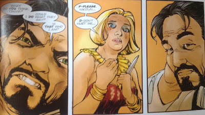
you. Nonetheless, there aren't many who can compete with him for drawing men and women who can be beautiful and flawed in equal measure.
 |
| The many faces of Nikolai Dante part 1 Words by Robbie Morrison |
 |
| The many faces of Nikolai Dante part 2 Words by Robbie Morrison |
 |
| The many faces of Nikolai Dante part 3 Words by Robbie Morrison |
 |
| Oops! That's not gentleman thief Nikolai Dante. That's gentleman ronin Shimura pulling a Dante. Words by Robbie Morrison, so it's hardly copying. And there's a lush texture to the art, no? |
Then there’s the weird
angles thing. Fraser has something of a knack for framing a panel around a
character so that it appears he’s making it as difficult as possible for
himself to draw it. Instead of profiles or ¾ faces, he taken on 5/6 faces, or
draws from the perspective of the ground so you’re kind of looking up their
noses and that kind of thing.
 |
| Finding the angle to show a full face kiss. Followed by body morphing terror. Words by Robbie Morrison |
There’s logic to it,
of course. Choosing such outrageous angles brings everything to life. It
reminds you that Dante is a swashbuckler, throwing himself around in carefree
ways that show he doesn’t always think about what he’s doing before he’s doing
it.
 |
| Finding all the angles on Dredd Words by John Wagner |
Equally on his Dredd
work, it adds to the futuristic weirdness of the setting. There’s also
something incredibly comics about it. Sure, filmmakers can and do use dutch
angles**, but almost always the movement within the frame does a lot of the
work – Fraser’s single panel craziness achieves its own effect.
 |
| That's what I call a gunshot wound! Words by John Smith |
 |
| Pure comics. Love the way the train snakes into Dredd's helmet. Words by John Wagner |
Fraser’s creator-owned
series, Lilly MacKenzie, is written by the man as well as drawn by him. Opening
story the Mines of Charybdis had a very explicit focus on trying to be
realistic about space travel. It’s hard launching a rocket, it’s hard flying a
spaceship, and it’s hard landing one. Fraser uses all his tricks to get this
across, while also touching, again, on the realism of human bodies, and the
reality of getting bored and angry with your travelling companion.
For a cartoony artist,
I may be over-emphasising this realness aspect to his work. Yet it’s something
I draw very strongly from his work, along with its dynamism. Without both of
these, I’d probably raise an eyebrow at the emotional ups and downs that, say,
Nikolai Dante goes through on a weekly basis, rather than drinking it up and
letting it move me to my bones.***
I’m not sure I’d quite
realised it before writing this all down, but Simon Fraser really is one of my
very favourites.
More on Simon Fraser
Check out his ongoing
Lilly MacKenzie story, the Treasure of Paros, over on Act-I-Vate comics
A 30 minute youtubeclip showing him creating a Nikolai Dante cover
Talking about his
final Dante cover on Covers Uncovered
A Q&A from 13thDimension
And an interview on the ever-dependable Everything Comes Back to 2000 AD podcast
Personal favourites:
The Adventures of Nikolai Dante
Judge Dredd: Blood Cadets; Zoom Time; Jumped
Shimura: Dragon Fire
Lilly MacKenzie and the Mines of Charybdis
*I’ve no idea if this
phrasing is copyrighted, but I first came across it from Chris Claremont’s New
Mutants / X-Men work. Anyway, it fits here pretty well.
**apparently it’s the
technical term for tilting the camera.
***Stopping, very briefly, to acknowledge the sterling work of Fraser's regular colourist Gary Caldwell. I'm keeping brief and in the footnotes 'cos I don't want to pre-empt the man's own upcoming blog entry...


Download Saimum Series all Bangla book
ReplyDeleteLove from mrlaboratory.info ❤❤